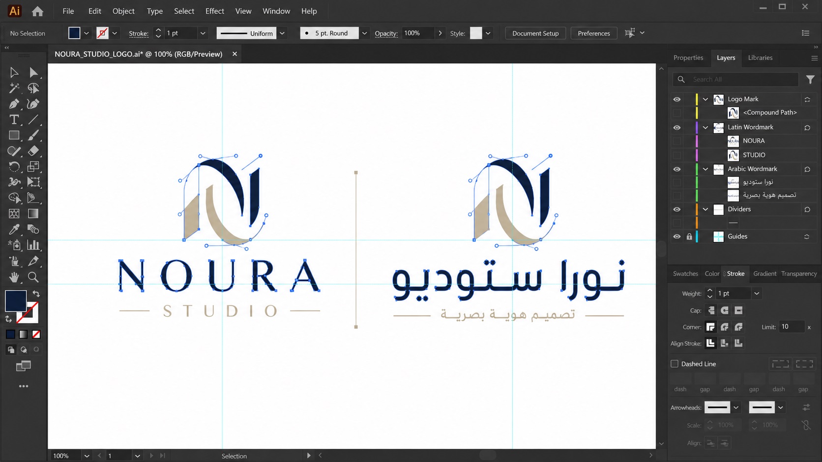
Not every logo is in English. Businesses operating across languages, or in communities where non-Latin scripts are the primary written form, need logos that handle Arabic, Chinese, Cyrillic, Hebrew, Korean, Hindi, or any number of other writing systems. Vectorizing these logos requires a different level of care than a straightforward Latin-alphabet design.
Here is what makes multi-language and non-Latin logos more complex to vectorize, and how to make sure the result is accurate and usable.
Why Non-Latin Scripts Require More Attention During Tracing
When a designer traces a Latin-alphabet logo, they can usually verify the result visually and are familiar with how the letters should look. A slightly off curve on a letter S or a misplaced anchor point on a letter A is immediately obvious.
For non-Latin scripts, many tracers are working outside their native writing system. Small errors in letterforms that would be immediately obvious to a native reader may not be caught during the tracing process by someone unfamiliar with the script. A curve that looks acceptable to a tracer who does not read Arabic or Mandarin might be clearly wrong to someone who does.
This is why multi-language logo vectorization requires either a tracer with genuine familiarity with the script, or a clear and careful review process by someone who can read the language.
Common Scripts and Their Specific Challenges
Arabic and Farsi
Arabic script is written right to left and letters connect to one another within words. The shape of each letter changes depending on whether it is at the beginning, middle, or end of a word. Fine details in the connecting strokes and the diacritical marks (small marks above or below letters that affect pronunciation) are often part of logo design in Arabic.
When tracing an Arabic logo, these connecting strokes and fine details need to be reproduced accurately. Oversimplification can change the meaning or make the text unreadable to native readers.
Chinese, Japanese, and Korean
Chinese characters, Japanese kanji and kana, and Korean hangul are visually complex systems with many strokes per character. Each stroke has a specific weight and direction that is part of the character's correct form.
In logo contexts, these characters are often stylised or have custom letterforms that are unique to the brand. Tracing them accurately means preserving not just the recognisable outline of each character but the specific weight variations, stroke endings, and design choices the original designer made.
Cyrillic
Cyrillic shares many letterforms with Latin but has its own characters and conventions. A tracer familiar with Latin alphabets may overlook subtle differences in how certain Cyrillic letters should look, particularly in stylised or custom logo fonts where the distinction is less obvious.
Hebrew
Like Arabic, Hebrew is written right to left. The letters are block-form rather than connected, but many have subtle features, including the presence or absence of small finishing strokes on certain letterforms, that matter to readers of the script.
Devanagari and Other South Asian Scripts
Scripts like Devanagari (used for Hindi, Sanskrit, Marathi, and others) feature a characteristic horizontal line running across the top of characters, connecting letters within words. This line is structurally important and must be reproduced accurately. Many Devanagari letterforms also have enclosed areas and fine internal structures that require careful handling.
Bilingual and Multi-Language Logos
Many businesses, particularly those operating in multilingual markets, use logos that include text in two or more languages or scripts. A company with offices in both English-speaking and Arabic-speaking markets, for example, might have a logo that displays the brand name in both Latin and Arabic characters.
Bilingual logos add complexity in several ways.
Visual balance: The designer has usually made careful decisions about how the Latin and non-Latin text relate to each other in size and weight to create visual balance. A tracer needs to preserve this balance, not just reproduce each script in isolation.
Separate version management: Bilingual logos sometimes need separate versions for specific contexts, for example, a version with only the Latin text for some markets and a version with only the Arabic text for others, as well as the combined bilingual version. Each of these needs to be vectorized correctly and organised clearly.
Direction and alignment: Text direction can differ between scripts within the same logo. The overall layout needs to be preserved accurately.
What to Provide When Ordering Multi-Language Logo Vectorization
If you are having a logo vectorized that includes non-Latin script, a few things help ensure the best result:
Provide the highest quality source image available. Fine script details are much easier to trace accurately from a large, clean source than from a small or compressed image.
Provide the text content in plain text form if possible. Knowing what the text says allows the tracer to verify that the letterforms are correct by cross-referencing with known correct forms of the characters.
Specify if there are intentional stylistic departures from standard letterforms. Custom logos sometimes modify standard characters as a design choice. Knowing which deviations are intentional versus which might be errors helps the tracer preserve the right details.
Provide a native language review if possible. If you have a colleague or contact who reads the script in the logo, having them review the vector result before final delivery catches any subtle errors that might be missed.
How to Verify the Result as a Non-Reader
If you do not read the language in your logo, reviewing the vector result requires a slightly different approach than you might use for a Latin logo.
Ask a native reader to review the text for accuracy. Even a brief check by someone who reads the script will catch any obvious errors in the letterforms.
Compare the vector result visually against the original source image at a high zoom level. The shapes should match closely, with clean smooth paths following the original lines accurately.
Check that any connecting strokes between letters in connected scripts are correctly handled and that no details have been dropped or simplified in ways that change the character forms.
Frequently Asked Questions
Can any logo with non-Latin text be vectorized?
Yes, though complex scripts take more care and time than simple Latin alphabets. The key is having a clean enough source image to work from and taking the time to verify accuracy.
What if my logo has a mix of English and another language?
This is common and straightforward to handle. Both portions of the logo are traced as part of the same file, maintaining the original design relationship between the scripts.
How do I know if the vector result is accurate if I do not read the language?
A native reader review is the most reliable check. Visual comparison against the source at high zoom is also useful. For standard scripts, the tracer can also cross-reference against known correct letterforms to verify accuracy.
Does the file format matter for multi-language logos?
Not specifically for the script itself. AI, EPS, SVG, and PDF all handle non-Latin characters correctly when text is converted to outlines, which removes the font dependency. Converting to outlines is especially important for non-Latin text since the fonts are less likely to be available on any given printer or designer's system.
Can I get separate versions of my bilingual logo?
Yes. If your logo has versions with different language combinations, you can request each version as a separate file. This makes it easy to use the appropriate version in different markets.
Need artwork converted?
VectorFixer can redraw logos, convert PNG files to SVG, and prepare clean production-ready vector files.
Contact Us