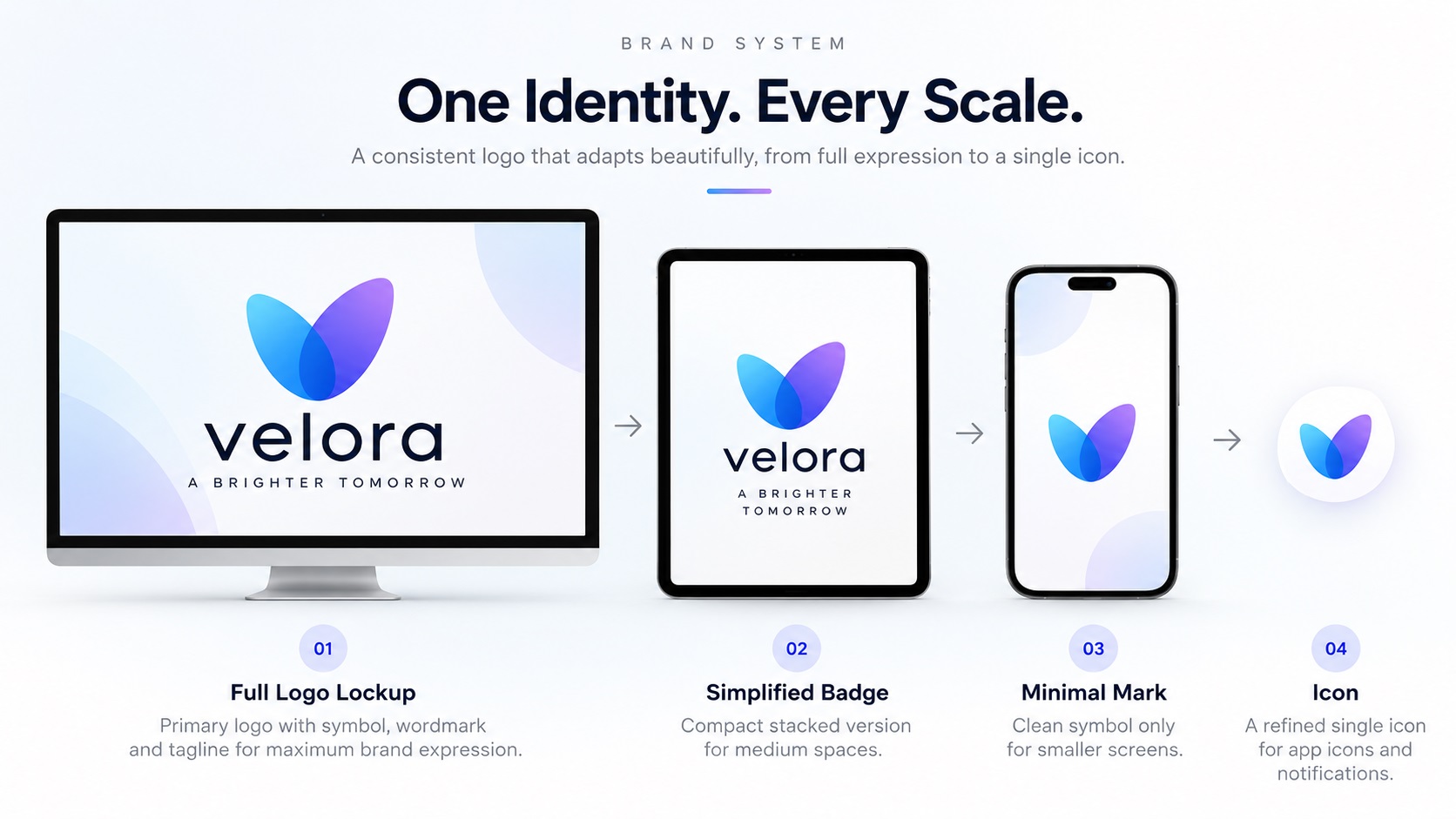
One of the most talked-about logo design concepts in 2026 is the adaptive logo, sometimes called a morph-mark. Rather than a single static design used everywhere, an adaptive logo is a system where the logo intelligently simplifies or transforms based on the context it appears in.
A brand might present a detailed illustrated crest on a large desktop display, simplify to a clean badge on a tablet, reduce to a minimal monogram in a mobile notification, and collapse to a single icon in a favicon. All of these are versions of the same brand identity, designed to give the right level of detail and complexity for the space available.
For large, well-resourced brands this is a motion design and engineering challenge. For most small businesses, the practical version of the same idea is simply having a well-organised set of logo variants, each sized and simplified for a specific context. The concept has a sophisticated name, but the underlying need is one that practical businesses have always had: the right version of the logo for each situation.
Here is what adaptive logo thinking means for the files you actually need.
The Core Idea: Logos That Respond to Their Environment
The adaptive logo trend comes from two converging pressures. First, brands now appear across a wider range of screen sizes and contexts than ever before, from large monitor displays to smartwatch notifications, from billboard-scale printing to 16-pixel favicons. Second, audiences have shorter attention windows and visual environments are more cluttered, making it more important that a logo communicates clearly in the space it has available rather than forcing one design to work everywhere.
The response from designers has been to treat the logo less as a single fixed asset and more as a flexible system with rules for how it adapts. The brand identity stays consistent. The execution changes to suit the context.
What This Looks Like in Practice
For most businesses, an adaptive logo system is not a complex technical or motion design project. It is a set of clearly defined, pre-approved variants that each work in a specific context:
Full complexity version: The complete logo with all elements at their designed weights and sizes. Used for large-scale applications where every detail is visible: website hero sections, printed materials, signage, high-quality marketing.
Medium complexity version: A simplified but still complete version, typically removing secondary elements like taglines or decorative details. Used for standard digital applications, document headers, and mid-size print applications.
Reduced version: The logo stripped to its most essential elements, often the icon and a simplified wordmark without decorative elements. Used for smaller digital placements, social media thumbnails, and constrained print contexts.
Minimal version: Icon or monogram only, no wordmark. Used for profile pictures, app icons, favicons, small embroidered badges, and any context where the full wordmark would be too small to read.
Each version should be designed deliberately rather than produced by simply making the full logo smaller. Shrinking a complex logo to a small size does not create a good small-version logo. It creates a small, illegible version of a complex logo.
What Files You Actually Need
For an adaptive logo system to work in practice, each version needs to exist as a clean vector file alongside appropriate raster exports. This means:
For each complexity level:
- AI and EPS for print production and professional vendor use
- SVG for web and digital implementation
- PNG with transparent background at appropriate sizes for digital everyday use
For each complexity level, color variants:
- Full color version
- Single-color black version
- White version for dark backgrounds
The total set of files for a properly built adaptive system is larger than for a single logo, but each file has a specific purpose and the system prevents the guesswork of trying to make one file work in every context.
Why This Connects to Existing File Format Needs
The practical needs behind adaptive logos are not new. Businesses have always needed:
- A version of their logo that works on an embroidered cap (small, bold, no fine detail)
- A version that works in a square social media profile picture
- A version that works on a large sign (full detail, maximum impact)
- A version that works on a pen or small merchandise (minimal, legible)
Adaptive logo thinking formalises these needs into a designed system rather than leaving them to be improvised each time a new production need arises. The file requirements are the same; what changes is the intention and organisation behind them.
How to Build an Adaptive System From an Existing Logo
If you have an existing logo and want to develop it into an adaptive system, the process is straightforward:
Step one: Get a clean vector version of your current logo if you do not already have one. This is the source from which all variants are built.
Step two: Identify the complexity levels your brand actually needs based on the contexts where your logo appears.
Step three: Work with a designer to create each variant deliberately, not by shrinking the full version but by redesigning for each context.
Step four: Produce clean vector files for each variant in all required formats.
Step five: Document which variant to use in which context and store the files in a clearly organised, accessible location.
For many businesses, steps one and two are already done intuitively through informal practice. Formalising this into a designed system with proper files makes the implicit explicit and produces more consistent results.
Frequently Asked Questions
Do I need a motion designer to build an adaptive logo?
For the static variant approach described in this article, no. Motion design is involved in true morph-mark logos where the logo animates between states, which is relevant for tech brands and digital-first businesses with the resources to implement it. For most small businesses, a set of carefully designed static variants achieves the same practical goal without the complexity.
How many variants does an adaptive logo system actually need?
For most small businesses, three to four variants cover the practical range: a full version, a compact version, an icon or minimal version, and a single-color version of each. More variants are only needed if the brand genuinely appears in many distinct contexts that each need a different level of detail.
We already have a primary logo and an icon version. Is that an adaptive system?
In practice, yes. You have already implemented the core concept even if you did not call it that. The next question is whether each version exists as a clean, properly named vector file in all the formats it needs to be used in.
Can a logo vectorization service help build out adaptive variants?
Some can, including producing the additional simplified variants alongside the standard vectorization of the primary mark. Ask about this when placing your order if building out a full system is part of what you need.
Need artwork converted?
VectorFixer can redraw logos, convert PNG files to SVG, and prepare clean production-ready vector files.
Contact Us