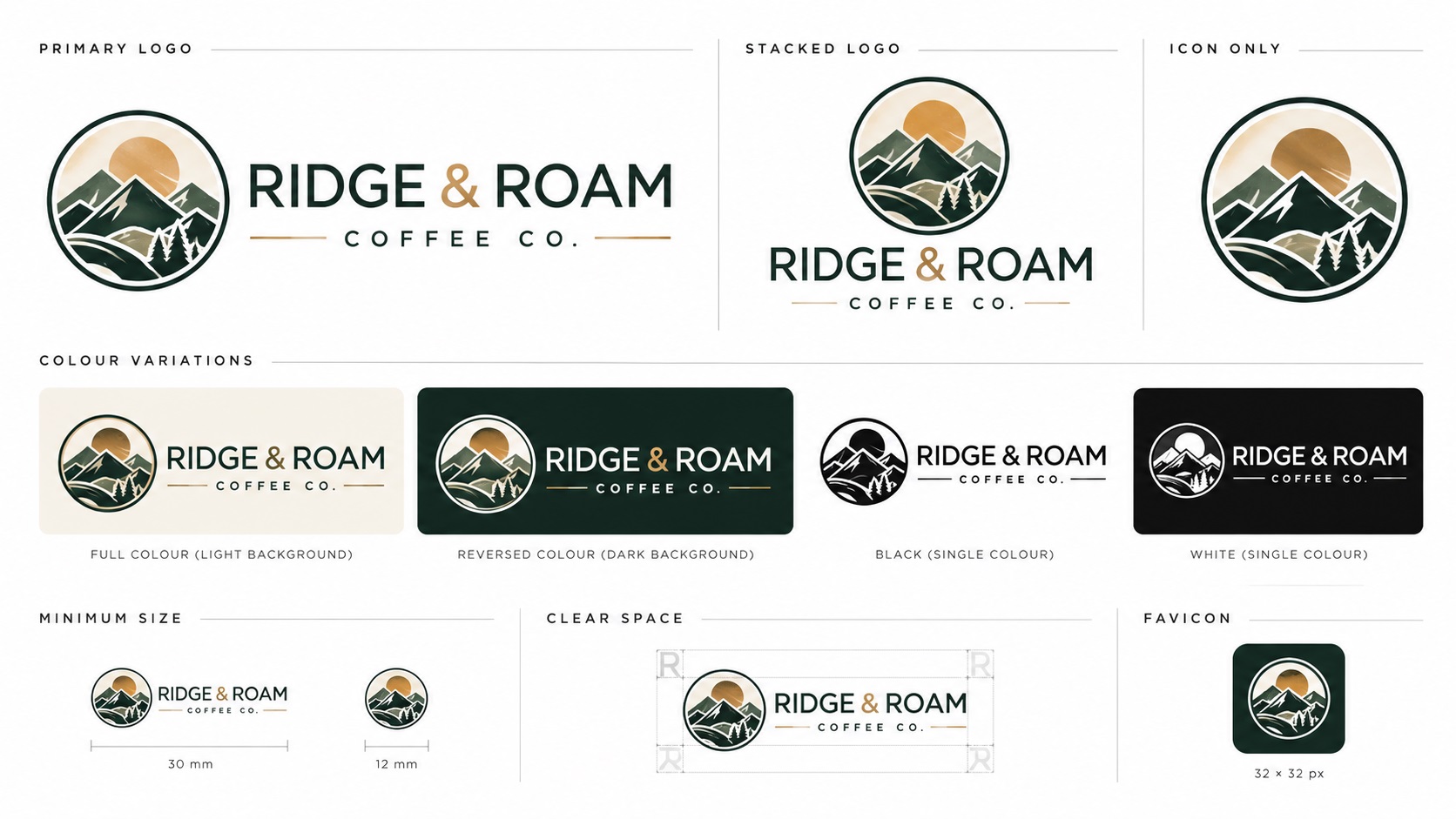
One of the clearest shifts in branding thinking in 2026 is the move from a single logo to a responsive logo system. Rather than using one version of a logo everywhere and hoping it works, businesses are building a structured family of logo variants that are each optimised for specific contexts.
This is not just a trend for big companies. For any business that uses their logo across a website, social media, signage, embroidery, small merchandise, and printed materials, a responsive system is simply a more practical and professional approach than trying to make one version do everything.
Here is what a responsive logo system is, what it typically includes, and what files you actually need to run one properly.
What a Responsive Logo System Is
A responsive logo system is a set of coordinated logo versions that share a consistent visual identity but are each adapted for a specific size range or context. The versions are not different logos. They are planned adaptations of the same logo, designed to maintain recognition and quality as the logo moves from large-scale to small-scale applications.
The concept borrows from responsive web design, where a website layout adapts to different screen sizes rather than using a single fixed layout. The same principle applied to logos means having a considered answer to every size and context rather than forcing one version to work everywhere.
The Most Common Versions in a Responsive System
Primary Mark
The full logo as it was designed: typically a combination of the icon or symbol and the wordmark, sometimes with a tagline. This is the definitive version used in contexts where there is enough space to show all elements clearly, such as website headers, signage, marketing materials, and printed documents.
Secondary or Compact Mark
A simplified or more condensed layout of the same logo, used when the primary mark is too wide or too detailed for the available space. This might be a stacked version where the icon sits above the wordmark rather than beside it, or a version with the tagline removed.
Icon Mark
The standalone symbol, monogram, or icon without the wordmark. This is the version used where the wordmark would be too small to read clearly: social media profile pictures, app icons, favicons, embroidered cap logos, small badge pins, and any context where only a small square or circular space is available.
Monogram or Lettermark
For brands whose identity includes a monogram or initial-based mark, this version uses initials or an abbreviation rather than the full name. Works well at very small sizes and in contexts where the full wordmark would not be readable.
Single-Color Versions
Every version of the system should also have a single-color equivalent: a fully black version and a fully white version. These are used for engraving, single-color embroidery, foil stamping, embossing, certain screen printing applications, and any context where color is limited or where the logo needs to sit on a colored background.
Why One Logo Version Does Not Work for Everything
The problem with trying to use a single logo version everywhere is predictable once you see it happen:
A horizontal logo with a wide wordmark looks great in a website header but becomes unreadably small in a square social media profile picture. Squeezing the full horizontal version into a square space means the text is a fraction of the size it should be.
A detailed primary mark with fine text and intricate detail looks professional on a business card but becomes a blob of stitching when embroidered on a cap at 70mm wide.
A full-color version looks correct on a white background but disappears entirely when placed on a dark-colored bag or a dark uniform.
Each of these failures is predictable and preventable. A responsive system addresses each one with a version that was designed for that context.
What Files a Responsive System Needs
For a complete responsive logo system to function across all its contexts, each version needs to exist as a clean vector file. This means:
- The primary mark in AI and EPS for print production
- The primary mark in SVG for web and digital use
- The compact or secondary mark in the same formats
- The icon mark in AI, EPS, SVG, and as a high-resolution PNG for app icon and profile picture use
- All versions in black and white single-color variants
- All versions in reversed (white) form for dark backgrounds
- A PDF of each version for document and sharing use
- Brand color values documented in hex, RGB, CMYK, and Pantone
For a business that only has a single PNG of their logo, building a responsive system starts with getting that PNG vectorized and then having the additional versions built from the clean vector source.
The Business Case for a Responsive System
A responsive logo system sounds like something only larger businesses need, but the argument for having one is actually strongest for smaller businesses.
Larger companies have design teams who solve the one-size-does-not-fit-all problem on the fly for every project. Smaller businesses do not have that resource. A responsive system that is set up once gives every team member, every vendor, and every platform the right version to use without requiring design judgment each time.
The practical effect is that the brand looks more consistent and more professional across all its touchpoints without anyone needing to make design decisions on the fly.
How to Build a Responsive System From an Existing Logo
If you have an existing logo and want to develop it into a responsive system, the process typically involves:
- Getting a clean vector version of the current logo if one does not exist
- Working with a designer to create the additional variants: compact layout, icon version, monogram if applicable
- Producing black, white, and reversed versions of each variant
- Exporting the complete set in all required formats
- Organising the files with clear naming and storing them in a shared, accessible location
- Creating a brief usage guide showing which version to use in which context
For many businesses, steps one and two are the most involved. A vectorization service handles step one, and a logo designer handles step two. In some cases, a service that combines both can produce the full system from a single brief.
Frequently Asked Questions
How many versions does a responsive system actually need?
For most small businesses, three to four versions cover the majority of situations: a primary mark, a compact or stacked version, an icon-only version, and single-color variants of each. Very large organisations with many touchpoints may have more, but three to four covers most practical needs.
I just need my logo for a website and social media. Do I still need a system?
For digital-only use, a primary mark and an icon version cover the main bases. A website header uses the full logo. A social media profile picture uses the icon. That is already a two-version responsive system even if you did not call it that.
We already have multiple versions of our logo but they were never officially organised. How do we turn that into a system?
Audit what you have, confirm each version is in proper vector format, fill in any gaps, and create a clear naming and storage structure. If some versions exist only as PNGs, those need vectorizing before they can be part of a proper system.
Our designer gave us one logo file. Should we ask them to produce the full system?
Yes, and ideally this should be part of any professional logo design brief. A delivery that includes only a single primary mark without variants is an incomplete logo package for most modern businesses.
Can the same vectorization service that makes my logo vector also build out the additional system variants?
Some can, yes. When placing your order, ask whether building out additional variants (compact layout, icon version, single-color versions) is within their scope.
Need artwork converted?
VectorFixer can redraw logos, convert PNG files to SVG, and prepare clean production-ready vector files.
Contact Us