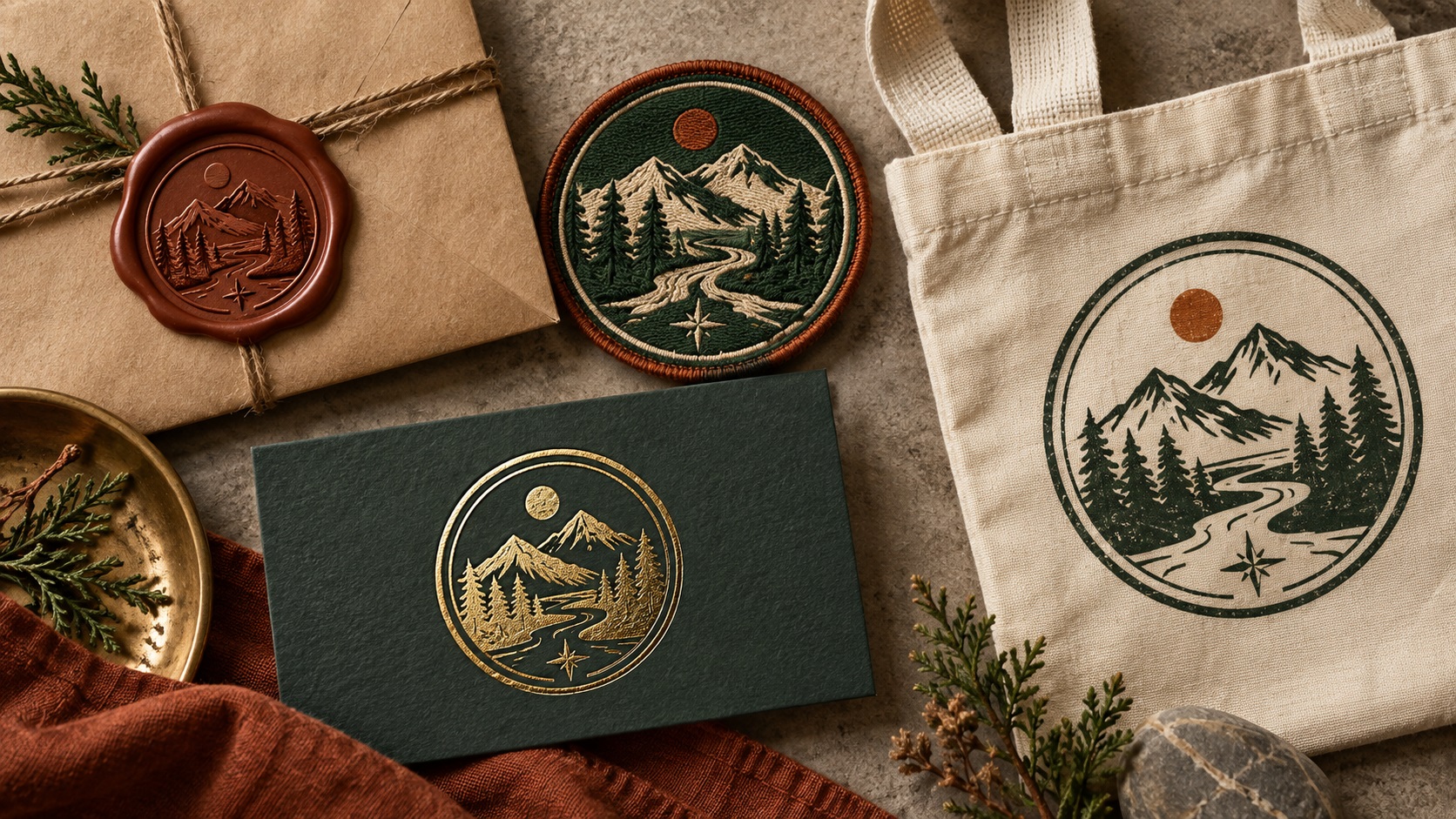
Stamp and seal logo styles are one of the standout design trends of 2026. Compact badge formats, circular and shield compositions, vintage seal aesthetics, and designs that look like they were pressed from a physical stamp are everywhere in branding right now, particularly for food, craft, independent retail, and hospitality businesses.
There is a reason this style has endured and why it is resurging in 2026. Beyond the aesthetic appeal, the stamp and seal format is one of the most practically versatile logo structures for physical production. It works well across more different production methods than almost any other logo style.
Here is why, and what you need to know if you are using or designing a stamp-style logo.
What Makes a Stamp or Seal Logo
A stamp or seal logo is typically characterised by:
- A contained, self-sufficient shape: circle, oval, shield, badge, hexagon, or similar
- Design elements that fit within or around that shape rather than extending outward
- Text, often arranged in an arc following the outer boundary of the shape
- An icon or central illustration within the shape
- A composition that works as a complete unit, reading clearly even when the surrounding color or material changes
- A design that is inherently complete in a small footprint
This structure is not just aesthetically pleasing. It is practically functional in ways that other logo formats are not.
Why This Style Suits Physical Production
It Works at Small Sizes
The contained, self-referencing nature of a badge or seal logo means it communicates the brand effectively even at very small sizes. The shape itself creates a visual boundary that draws the eye and signals that this is a complete brand mark.
A horizontal logo with a wide wordmark needs a certain minimum width before the text becomes readable. A circular badge can be read as a brand mark even when the text within it is too small to make out, because the overall shape and composition carry recognition.
This is why stamp and seal formats are popular for embroidered cap logos, small patches, lapel pins, enamel badges, and any small-format application.
It Is Inherently Single-Color Capable
Most stamp-style logos are designed to work in a single color. The shape, the arc text, and the central element all read clearly in one ink or thread color. This makes stamp logos ideal for:
- Single-color embroidery
- Single-color screen printing
- Laser engraving on metal, wood, and leather
- Rubber stamps and wax seals
- Embossing and debossing on stationery and packaging
- Pad printing on promotional products
- Die-cut vinyl in a single color
Few other logo formats translate to this many single-color applications as naturally as a well-designed stamp or seal.
It Fills a Shape Naturally
Many branded applications require the logo to fill a defined space: a circular patch, a square social media icon, a round embroidered badge, a circular foil stamp on packaging. A horizontal or abstract logo that was not designed for a contained shape requires cropping, padding, and compromise to fit these applications.
A badge or seal logo fills a circular or badge shape naturally because it was designed that way. No recomposition needed. The design simply works in the space it is placed in.
It Ages and Distresses Well
The vintage and distressed aesthetic that is so prominent in 2026 branding works particularly well with badge and seal formats. The stamp-pressed look, slightly worn edges, and analog texture that many of these logos incorporate fit naturally within the contained badge shape.
For production contexts where a natural distressed quality is desirable, the badge format carries that aesthetic convincingly. For production contexts where a clean version is needed, the underlying shapes are clean and functional.
What Vector File Structure Stamp Logos Need
A stamp or seal logo typically has these structural elements in the vector file:
Outer boundary shape: The circle, oval, or badge outline. This should be a clean closed path.
Text arranged in arc: Text following the curve of the outer boundary. This text must be converted to outlines before the file is used for production. In Illustrator, text on a path needs to be converted to outlines before the font dependency is removed.
Dividing lines or decorative elements: Many badge logos have thin lines, dots, or ornamental details between text and the central element. These should be clean vector paths at sufficient line weights for the production method being used.
Central icon or illustration: The main illustrative element in the center of the badge. This should be clean vector paths, not a raster image embedded within the SVG or AI file.
The whole composition should be a single self-contained unit in the file, ideally grouped or compounded so it can be moved, scaled, and placed as a single object.
Common Problems With Stamp Logo Files
Arc Text Not Converted to Outlines
Text arranged on a circular path in Illustrator is particularly prone to not being outlined before the file is shared. Live text on a path reflows completely if the path or text formatting is different on the receiving system. Always convert text on a path to outlines before submitting a stamp or seal logo for production.
Thin Decorative Lines Below Production Minimum
The fine dividing lines, dots, and ornamental separators common in badge logos often fall below the minimum line weight for embroidery and pad printing at small sizes. A file that looks correct on screen may have 0.2mm lines that cannot be stitched or stamped at the intended product size.
Check line weights against the minimum for the production method and scale the logo to the intended production size before assessing whether lines are heavy enough.
Raster Texture Overlay
Many badge logos have a vintage or distressed texture applied over the design to give the stamp-pressed aesthetic. This texture is often a raster overlay, not a vector element. For production use, the clean underlying vector is what actually matters. The texture overlay may or may not be reproducible depending on the production method.
Always have both a textured version for digital and large-format print use and a clean vector version for embroidery, single-color screen printing, engraving, and other production methods.
Frequently Asked Questions
Is a stamp or seal logo harder to vectorize than a simpler design?
Not necessarily, though the arc text and fine decorative details require careful handling. The contained format of a badge actually makes many tracing decisions clearer because the composition has defined boundaries. The main specific challenges are the arc text and fine decorative elements.
My seal logo has very fine text around the border. Will that survive embroidery at cap size?
Depends on the text size at the embroidered dimensions. Arc text in a circular badge is often very small at cap logo sizes. At 70 to 80mm wide, text around the outer ring may be only 2 to 3mm tall, which is at or below the practical minimum for embroidery. Many businesses use the central icon only for embroidered versions and reserve the full seal for larger applications.
Can the same file be used for both a vintage distressed version and a clean production version?
The clean vector version is the base. Texture and distress effects are typically applied separately for digital and large-format print. The clean base produces the production-ready file for embroidery, engraving, and single-color applications.
My seal logo was generated by an AI tool and has that distressed aesthetic baked in. What do I need?
The AI output is a raster image. The design needs to be redrawn as a clean vector to be production-ready. The underlying shapes, arc text, and icon should be rebuilt as clean vector paths. The distressed aesthetic can be re-applied digitally for appropriate output contexts.
Need artwork converted?
VectorFixer can redraw logos, convert PNG files to SVG, and prepare clean production-ready vector files.
Contact Us