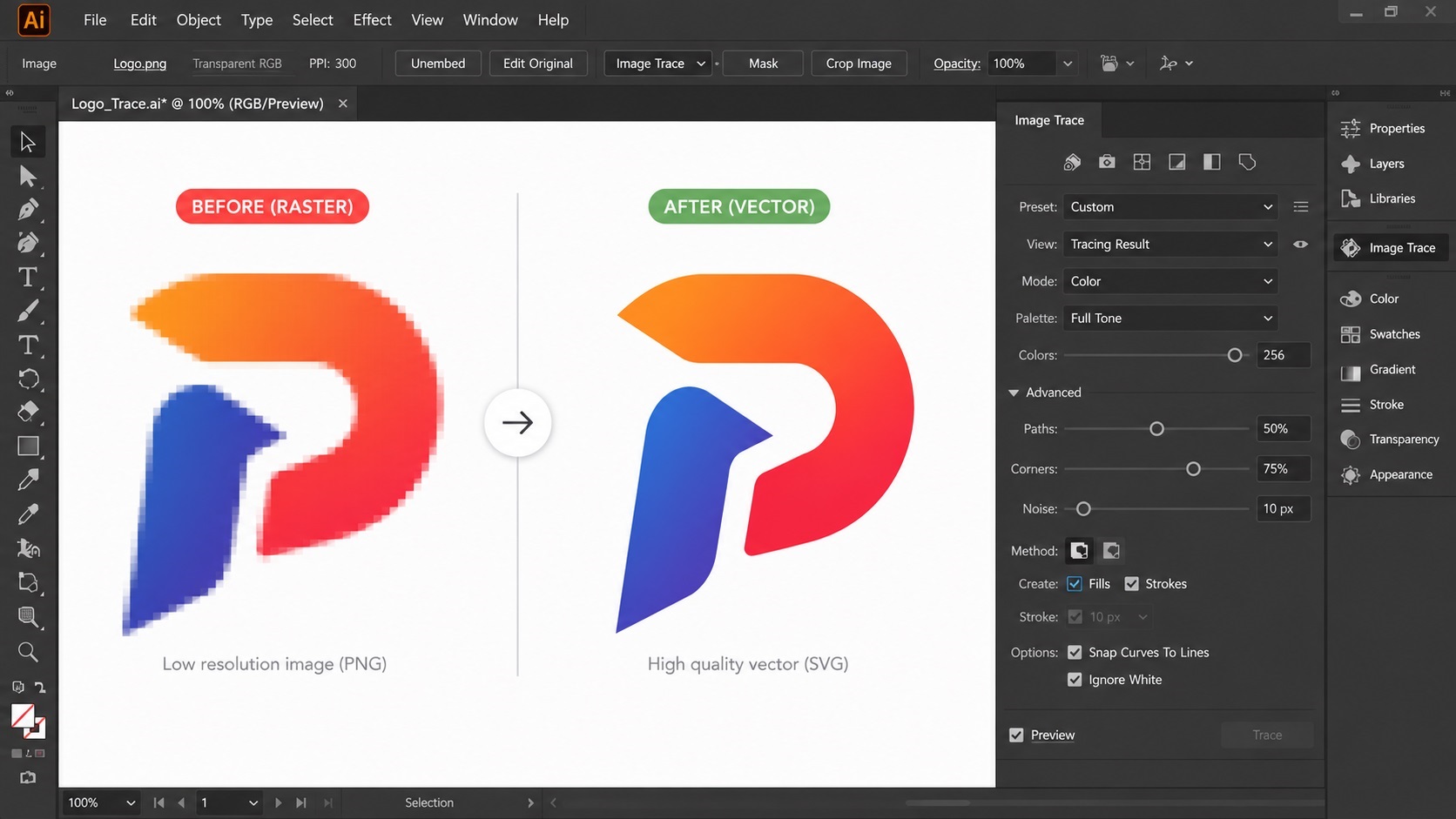
If you have ever right-clicked an image in Adobe Illustrator, you have probably seen the Image Trace option. Click it, and Illustrator attempts to convert your raster image into vector paths automatically. It is built into the software, it is free to use, and it sounds like exactly what you need when someone asks for a vector version of your logo.
Sometimes it works great. Often, it does not. Here is a real look at what Image Trace is good for, where it falls short, and how to know which situation you are in.
How Image Trace Works
Image Trace looks at the colors and shapes in your raster image and tries to recreate them using vector paths. You can adjust settings like color mode, threshold, paths, corners, and noise to influence how the tracing is done.
The tool works by detecting edges between different colors or tones and drawing paths along those edges. More complex settings can break the image into more detailed color groups, while simpler settings produce fewer, larger shapes.
Once traced, you can expand the result into editable vector paths, which can then be adjusted, recolored, or cleaned up manually.
When Image Trace Works Well
Image Trace tends to produce usable results in a few specific situations.
Simple, High-Contrast Logos
A logo with a small number of solid colors, clean edges, and no gradients or shadows is the best case scenario for Image Trace. Think of a simple icon in one or two flat colors with sharp geometric shapes. In cases like this, Image Trace can often produce a clean result with minimal cleanup.
Black and White Line Art
Simple line drawings, especially black lines on a white background, tend to trace reasonably well. The high contrast between the line and the background gives Image Trace a clear edge to follow.
Starting Points for Manual Cleanup
Even when the result is not perfect, Image Trace can sometimes give a designer a rough starting shape that is faster to clean up than drawing completely from scratch. This is more of a workflow shortcut for an experienced designer than a finished product on its own.
Where Image Trace Falls Short
Gradients and Soft Shading
Image Trace does not understand that a smooth gradient is meant to be one continuous color transition. Instead, it sees dozens or hundreds of slightly different colors and creates a separate shape for each one. The result is often a logo made of countless tiny bands of color, which looks rough and is extremely difficult to edit.
Text and Fine Detail
Text is one of the weakest areas for Image Trace. Letters can come out with rounded corners that should be sharp, uneven stroke widths, or merged details that should be separate. If your logo includes a wordmark, Image Trace often will not produce text that looks crisp and professional.
Low-Resolution Source Images
If your starting image is small or low quality, Image Trace has less information to work with. Blurry or pixelated edges in the original get traced as blurry or jagged vector paths. No amount of adjusting the trace settings can recover detail that was not in the original image to begin with.
Complex Multi-Color Designs
Logos with many colors, especially with overlapping shapes or subtle color variations, tend to produce extremely messy results. You may end up with a vector file containing hundreds or thousands of individual paths, many of them tiny slivers that serve no real purpose.
How to Tell If Your Logo Is a Good Candidate for Image Trace
Ask yourself these questions about your logo:
- Does it use a small number of completely flat, solid colors?
- Are the edges sharp and clean in the original file, with no blur?
- Is there little to no text, or is the text large and simple?
- Is there no gradient, shadow, or glow effect anywhere in the design?
If you answered yes to most of these, Image Trace might get you a usable result with some adjustment of the settings. If you answered no to several of these, especially the gradient and text questions, Image Trace is likely to produce something that needs significant manual rework, or that simply will not look professional no matter how much you adjust the settings.
A Practical Workflow If You Want to Try Image Trace Yourself
If your logo seems like a reasonable candidate, here is a general approach:
1. Start with the highest resolution version of your image you have available 2. In Illustrator, select the image and open the Image Trace panel 3. Try the preset options first, such as "High Fidelity Photo" or "3 Colors," depending on your image 4. Adjust the threshold and color settings until the shapes look reasonably close to your original 5. Expand the trace into editable paths 6. Inspect the result closely, zooming in on edges, text, and any fine details 7. Manually clean up stray points, merge unnecessary shapes, and fix any distorted text
That last step is often the part people underestimate. Even a good Image Trace result usually needs some manual cleanup to be truly print-ready.
Frequently Asked Questions
Is Image Trace the same as professional vector tracing?
No. Image Trace is an automated tool that approximates your image using vector paths. Professional vector tracing typically involves a designer manually redrawing the logo with clean, deliberate paths. The manual approach generally produces a more accurate and usable result, especially for logos with text or gradients.
Can I use Image Trace and then just clean it up myself?
Yes, if you are comfortable working with vector paths in Illustrator. For simple logos, this can work well. For complex logos with text and gradients, the cleanup work can end up taking as long as redrawing from scratch.
Why does my traced text look wrong?
Image Trace follows the pixel edges of your text exactly as they appear in the raster image, including any blur, anti-aliasing, or compression artifacts. This often results in rounded corners, uneven strokes, or merged letters. Recreating text with an actual font is usually the better approach.
What settings should I use for a simple logo?
For logos with a small number of flat colors, try the "Few Colors" preset and adjust the number of colors to match your logo. For black and white line art, the "Black and White Logo" preset is a good starting point.
My logo has a gradient. Is there any way to make Image Trace handle it well?
Not really. Gradients fundamentally do not translate well to Image Trace's approach of tracing color boundaries. If your logo has gradients and you need a clean vector version, manual redrawing is generally the better path.
Need artwork converted?
VectorFixer can redraw logos, convert PNG files to SVG, and prepare clean production-ready vector files.
Contact Us