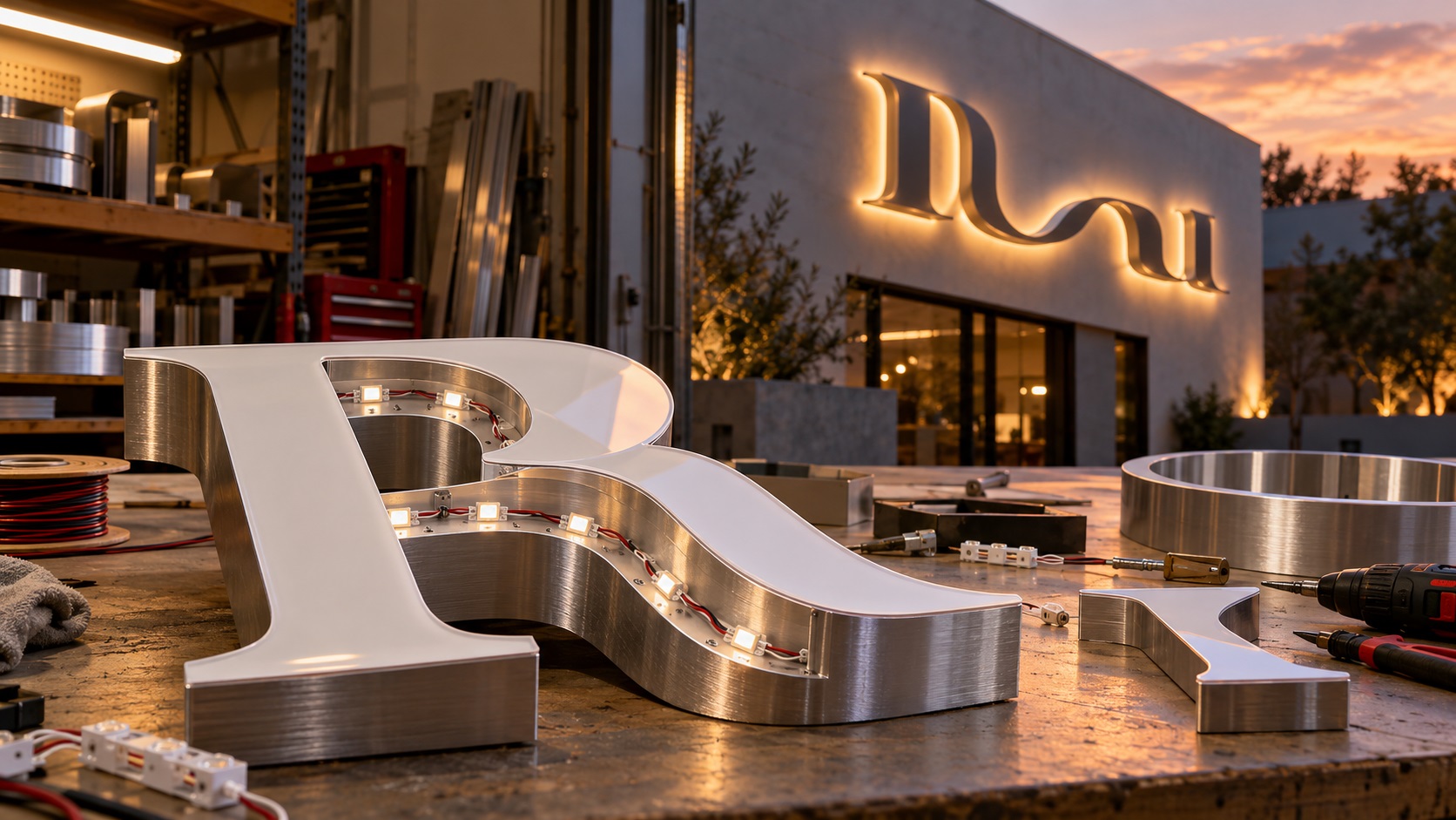
A business owner sends a logo to a sign company and asks for big illuminated letters above the storefront. The sign company replies that the lettering is too thin, the script is difficult to build, or the file cannot be used for fabrication.
The logo may be perfectly fine for business cards and a website. The problem is that an illuminated channel letter is not a printed graphic. It is a three-dimensional object with a face, a sidewall, electrical components, and a mounting system.
Before ordering, it helps to understand which parts of a logo can become channel letters, which details may need adjustment, and what kind of file the fabricator needs.
What exactly are channel letters?
Channel letters are individually fabricated three-dimensional letters or logo shapes. A typical illuminated version has metal sides, a front face or backing, and LEDs positioned to produce the intended light effect.
They are common on retail shops, restaurants, offices, clinics, and other storefronts.
Depending on the build, channel letters can be:
- Front-lit: the face of each letter glows.
- Halo-lit: light shines toward the wall behind the letter.
- Combination-lit: the sign uses both front and rear illumination.
- Non-illuminated: similar dimensional lettering without internal lighting.
These styles are not interchangeable. Each creates different requirements for the artwork, material, thickness, wiring, and wall surface.
If you only have a logo image, the sign shop must first translate it into manufacturable shapes.
Why a normal logo can fail as a channel-letter design
Think about a script logo with delicate connecting strokes and decorative loops.
It looks elegant printed on a letterhead. At storefront size, however, the sign company has to bend or fabricate sidewalls that follow those curves, fit the face, provide space for lighting where required, and attach the finished letters securely.
Some strokes are too narrow for a chosen build. Very tight interior spaces may be difficult to form. Small disconnected dots and tiny slogans add fabrication complexity.
The designer's job is to preserve the recognizable identity while making the shapes practical.
That may mean using a boldened version of the same lettering, slightly widening gaps, reducing tiny ornaments, or producing an approved simplified storefront logo.
A clean vector file is the starting point
Channel-letter production normally starts with vector geometry, not a screenshot.
The shop needs editable outlines it can inspect and use as a basis for fabrication drawings and cutting files.
Common source formats include:
- AI
- EPS
- Vector PDF
- SVG, when the shop supports it
A JPG or PNG may be adequate for a quotation reference, but it cannot by itself define precise cut shapes the way clean vector paths can.
Also, a PDF is not automatically vector artwork. It may contain a flattened image.
If you only have a small website logo, VectorFixer's logo vectorization service can rebuild the visible logo shapes as clean scalable artwork for the sign company's review.
The letter outline becomes a physical object
For printed graphics, a slightly uneven edge may disappear at normal viewing size.
With channel letters, the same edge can become the actual boundary that is cut or formed.
That is why the file should use deliberate, smooth curves.
Look for:
- Closed paths where the shape should be closed.
- Smooth, intentional letter contours.
- Proper openings inside letters such as A, B, P, and O.
- No unexpected stray shapes.
- No accidental double outlines.
- Clean spacing between neighboring letters.
- No hidden objects left over from automatic tracing.
The final manufacturing file may need additional fabrication layers beyond the logo master. The sign shop typically creates those production details after confirming the design and construction method.
How thin is too thin for illuminated lettering?
There is no universal minimum stroke width for every channel-letter project.
The usable width depends on the size of the letters, illumination system, sidewall construction, materials, and equipment.
Some fabricators publish minimum strokes around two inches for particular illuminated channel-letter products. That is a supplier-specific requirement, not a standard that applies to every sign.
Other techniques, dimensions, and constructions may support different widths.
This is why it is risky to read one number online and redraw the entire logo around it.
Ask the fabricator: "At our intended letter height, what is your minimum finished stroke width for this build?"
Then let that actual production limit guide any changes.
Small gaps inside letters matter as much as thick strokes
A logo may have thick letters but very small internal holes.
For example, the center of a stylized A or P may become too narrow once the sides and face construction are considered.
The issue is not always the overall width of the word. It may be the open space within each character.
A clean vector redraw can adjust these gaps deliberately.
The important thing is that the result still reads like the approved wordmark.
Before approving, compare the original logo with the modified sign version at the intended finished dimensions.
Why delicate script logos are challenging
Script can work in channel-letter signage, but certain forms are more difficult than others.
Potential issues include:
- Long hairline strokes.
- Sharp turns and tiny loops.
- Letters joined by narrow connectors.
- Small detached flourishes.
- Overlaps that look normal in print but confuse a cutting path.
- Very tight spaces between letters.
A sign shop may suggest fabricating the script as one connected shape rather than separate letters, or may recommend a different sign-making method.
Do not approve a heavy, blocky replacement without reviewing how much the logo's personality changes.
A good production version keeps the identifiable rhythm and character of the original lettering where possible.
What about tiny taglines beneath the logo?
The main company name may be suitable for channel letters while the tagline is not.
For instance, a 24-inch-tall wordmark with an extremely small slogan underneath may look balanced on a graphic mockup. But fabricating every tiny letter as an illuminated object could be expensive or impractical.
Alternatives include:
- Make only the business name illuminated channel letters.
- Place the tagline on a separate flat sign panel.
- Use printed or cut vinyl for secondary text.
- Remove the tagline from the building-sign variation.
- Increase the size if the available façade space allows it.
The strongest storefront sign is usually the one customers can read and recognize easily.
Front-lit versus halo-lit affects the result
With front-lit channel letters, light typically comes through the front face.
Colors and translucency of the face material affect the illuminated appearance.
With halo-lit letters, the front is usually opaque and light is directed back toward the building, creating a glow behind each shape.
That glow depends on the mounting distance and wall surface. A textured wall may produce a different effect from a smooth painted wall.
A logo with tiny gaps and intricate outlines may look different in a halo-lit treatment than it does in a front-lit treatment.
Ask the sign company for a proof that shows the intended illumination style on the actual building, not merely a flat logo on a black background.
Why the logo colors may change at night
A color shown on your monitor is not a guarantee of the same color under LEDs.
The final appearance depends on factors such as the acrylic face, vinyl overlay, paint finish, LEDs, and ambient lighting.
Provide the best brand-color references you have, but ask the supplier how closely the selected materials can reproduce them.
If an exact color match is essential, request samples or a physical test where possible.
Also ask whether the sign will look appropriate both illuminated at night and unlit during the day.
Letter depth is a real design variable
Channel letters have a front-to-back thickness, often called the return depth.
Depth affects construction, visual weight, and in some designs, the lighting system.
A thin printed logo cannot communicate this by itself.
The shop should quote or specify the depth it intends to use. Your artwork should not attempt to fake sidewall geometry with a drop shadow and assume that is adequate manufacturing information.
Provide a flat approved logo master, then work with the fabricator on the actual dimensional specification.
How will the sign mount to the building?
Two common approaches are individually mounted letters and letters mounted on a raceway or similar support.
Individual mounting can create a clean architectural appearance but requires appropriate wiring and attachment planning.
A raceway can consolidate wiring and support, though it changes the visible appearance of the storefront.
The exact system depends on building conditions, local rules, access, and the sign company's engineering process.
The sign installer, not a logo cleanup service, should determine structural attachment and electrical installation.
Ask for a mounting drawing or clear installation rendering before the sign is fabricated.
Why the building façade needs to be considered
The artwork might fit a rectangular mockup but not the real storefront.
Windows, columns, façade seams, existing fixtures, and available electrical access can affect placement.
A logo with a wide horizontal wordmark may need a different scale from a tall stacked logo.
Send the sign company photos and dimensions of the installation area.
If the site is in a shopping center or managed commercial building, check whether the landlord has sign criteria for letter size, illumination, placement, and finish.
Local permitting requirements can also limit what is allowed. Do not assume that because one nearby shop has a particular sign, the same design is automatically approved for yours.
Can the exact brand font be used?
If you have the original font or a correctly outlined vector master, it is easier for the fabricator to preserve the intended lettering.
But if the source is a blurry image, guessing the font may introduce changes.
It is often better to manually reconstruct the current wordmark than to choose a vaguely similar typeface without approval.
For production copies, outlining the text avoids font-substitution problems when a file moves between computers.
Keep a separate editable master if future text changes are likely.
Why automatic tracing often needs cleanup
Automatic tracing can turn the outline of a JPG into vector paths, but the result may contain excessive nodes, wobbly curves, and duplicated edges.
For a fabricated letter, those flaws can be important.
A manual redraw or careful path cleanup is useful when the outline itself will guide manufacturing.
VectorFixer's vector cleanup service can address messy traced contours and unwanted shapes before the sign shop develops its fabrication files.
The clean logo source should remain separate from electrical drawings, router instructions, and mounting templates.
What should you send when asking for a quote?
A helpful channel-letter inquiry includes more than the business name.
Send the fabricator:
- The cleanest logo file you have.
- The exact business name and any tagline.
- The approximate overall sign width and height.
- A photo of the storefront or installation area.
- Desired illumination style: front-lit, halo-lit, or another option.
- Brand color references.
- Whether a landlord or property manager has sign criteria.
- Any known permitted sign envelope or size restrictions.
- Your desired installation schedule.
- A note identifying any logo elements you do not want changed.
This helps the shop explain whether a fabrication-friendly variation is necessary and what it may cost.
A practical example: converting a fine-line café logo
Imagine a café called "Copper Lane" whose approved logo uses graceful script with a tiny slogan below.
A possible channel-letter solution might be:
- Keep the overall script silhouette.
- Strengthen the narrow connectors between letters.
- Open the smallest internal loops slightly.
- Remove the very small tagline from the illuminated portion.
- Put secondary text on a flat plaque nearby.
- Use the sign company's approved lighting and mounting approach.
The finished channel-letter sign still communicates the café's brand, but the physical shapes are designed to be manufactured.
An early approval proof should compare the original artwork and proposed modifications side by side.
Common mistakes to avoid
Sending only a low-resolution screenshot
The fabricator may have to redraw the logo before it can be quoted accurately.
Assuming all LED signs are the same
Front-lit letters, halo-lit letters, cabinet signs, and LED-neon-style signs have different construction methods.
Ignoring the smallest stroke and inner spaces
The logo's overall height does not tell you whether every detail can actually be fabricated.
Approving a flat visual mockup without dimensions
The shop needs agreed physical measurements, letter depth, mounting specifications, and installation conditions.
Changing the wordmark without approval
A manufacturing simplification should still be reviewed as an approved variation of the brand.
Confusing vector preparation with sign engineering
Clean artwork helps the fabricator, but it does not replace structural design, electrical planning, or permitting.
Frequently asked questions
Can any logo be made into channel letters?
Many logos can be adapted, but very thin lines, tiny details, or complicated shapes may require changes or an alternative sign type.
What file format does a channel-letter manufacturer need?
Many prefer AI, EPS, or vector PDF. Some also accept SVG. Confirm the exact requirement before exporting.
Can a PNG be used for a channel-letter sign?
It can help as a reference or for an initial quote. The actual manufacturing process normally needs accurate vector geometry prepared or approved by the sign company.
How thick do channel-letter strokes need to be?
There is no single answer for every product. Ask the fabricator for its minimum at the intended finished size and illumination style.
Is a channel-letter sign the same as LED neon?
No. Channel letters are formed three-dimensional letter structures. LED-neon-style signage commonly uses flexible lighting materials to create a different visual effect.
Will a vector redraw make my logo automatically ready for fabrication?
It provides a cleaner source. The sign manufacturer still needs to develop the construction, lighting, mounting, and installation specifications.
Keep the logo recognizable while making it buildable
The most useful channel-letter artwork is not simply a large copy of your existing image. It is a clean, accurately drawn logo that a sign fabricator can review, measure, and adapt into real physical letters.
If your logo is blurry, auto-traced, or too complicated to inspect, send it to VectorFix along with the sign company's artwork instructions. A clean vector master gives your fabricator a better starting point without automatically redesigning the identity.
Need artwork converted?
VectorFixer can redraw logos, convert PNG files to SVG, and prepare clean production-ready vector files.
Contact Us