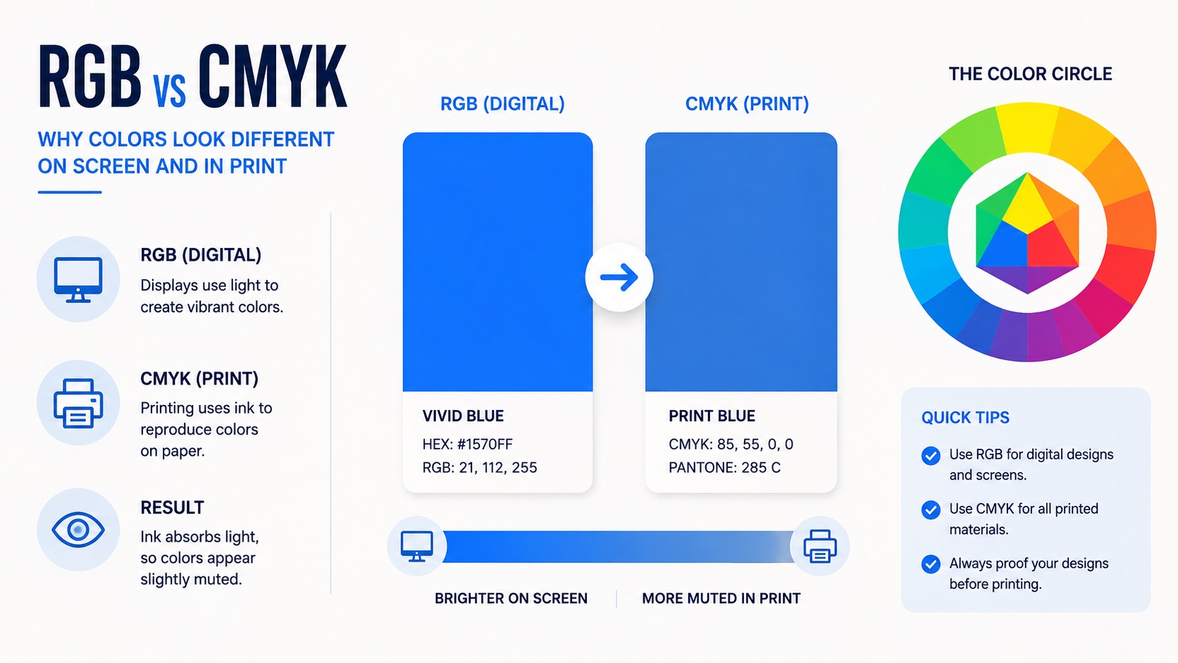
A lot of businesses pick their brand colors by eye on a screen. It looks great in the logo design file, looks great on the website, and everyone is happy. Then the first print order comes back and the color looks off. Slightly duller, slightly different, sometimes noticeably different. This is one of the most common surprises business owners run into, and it comes down to how color actually works across digital and print.
Here is what is happening and how to choose or adjust your brand colors so they hold up consistently everywhere.
Why Colors Look Different on Screen Versus in Print
Screens create color using light. Every pixel on your monitor or phone is made up of tiny red, green, and blue lights mixing together, a system called RGB. This is an additive color model, meaning combining all the colors at full brightness produces white.
Printing works the opposite way. Ink absorbs light rather than emitting it. Printers typically use a four-color process called CMYK, standing for cyan, magenta, yellow, and black. This is a subtractive model, meaning combining all the inks moves you toward black rather than white.
Because these are fundamentally different systems, not every RGB color has an exact CMYK equivalent. The range of colors achievable with light (RGB) is larger than the range achievable with ink (CMYK). Certain vibrant colors, especially bright blues, neon greens, and some purples, simply cannot be reproduced exactly in CMYK printing. When you convert a vivid RGB color to CMYK, it often becomes duller or shifts in hue.
Why This Matters for Your Logo Specifically
Your logo probably appears more places than almost any other piece of your brand. It is on your website, your business cards, your packaging, your signage, your social media, and possibly your vehicle or merchandise. Each of these uses a different color system.
If your brand color was only ever defined as a hex code or RGB value, every print vendor that touches your logo has to make their own decision about how to convert it to CMYK. Different vendors might get slightly different results. Your business cards might be a slightly different blue than your banner, which might be different again from your vehicle wrap.
This inconsistency is subtle but adds up. Customers may not consciously notice, but a brand that looks slightly different across different materials reads as less polished than one with tight, consistent color.
The Fix: Define Your Colors in Multiple Systems
The solution is to define your brand colors across all the systems they might be used in, rather than relying on a single value and letting each vendor interpret it.
A complete brand color specification includes:
Hex code: Used for websites and digital design. Example: #1A4FBA
RGB values: Used for screens and some digital applications. Example: R26 G79 B186
CMYK values: Used for most standard print production. Example: C92 M70 Y0 K0
Pantone (PMS) reference: Used for the most accurate and consistent ink matching, especially important for screen printing and large production runs where exact color matters.
Having all four of these defined for each brand color means every vendor, whether they are building your website or printing a banner, has a precise target to match rather than guessing based on a single value.
How to Get These Values for Your Brand Colors
If you already have an established brand color but only know it as a hex code, you have a few options.
A designer can convert your hex or RGB value to the closest CMYK and Pantone equivalents using professional color matching software. This gives you a starting point that is reasonably accurate.
For critical brand colors where exact consistency matters most, especially if you do a lot of print production, getting a physical Pantone swatch book and visually comparing it to your color in person is the most reliable way to choose the closest official match. Screen colors can vary by monitor, so trusting your eyes on a calibrated screen alone is not always reliable.
If you are choosing brand colors for the first time, working from a Pantone reference from the start, rather than starting purely from a screen color, can prevent this whole problem.
Colors That Are Especially Tricky
Some colors are more prone to shifting between RGB and CMYK than others.
Bright blues: Many vivid digital blues are simply outside the range of what CMYK printing can achieve and will print noticeably duller or shift toward purple.
Neon and fluorescent colors: These rely on light emission in a way that ink cannot replicate. If your brand uses a neon green or hot pink, expect a meaningful shift when printed, or consider using specialty inks designed for these colors.
Deep purples: These can shift toward blue or red depending on the specific CMYK formula used.
Pure black: Even black has nuance in print. A rich, deep black in professional printing is often achieved using a specific CMYK combination (called rich black) rather than 100 percent K alone, which can look more like dark gray.
If your brand relies on any of these tricky colors, it is worth discussing print expectations with your designer or print vendor early, rather than being surprised later.
Building This Into Your Logo Vector File
When you have your logo professionally vectorized, this is the ideal time to lock in your full color specification. A good vector tracing service can build your file with the exact CMYK and Pantone values defined, not just an RGB approximation.
This means every time the file gets sent to a new print vendor, the correct color information travels with it. No guessing, no inconsistency, no surprises at the printer.
Frequently Asked Questions
Why does my logo look different printed by two different companies?
This usually happens when your color is only defined in RGB or hex, and each vendor converts it to CMYK using their own process. Providing exact CMYK and Pantone values to every vendor solves this.
Do I need a Pantone color if I am only printing occasionally?
Not necessarily. For occasional small print runs, a good CMYK conversion is usually close enough. Pantone matching becomes more valuable for screen printing, large production runs, or situations where exact brand consistency is critical.
Can I just tell my printer the hex code of my brand color?
You can, but the printer will have to choose how to convert it to CMYK, which may not match what other vendors choose. Providing CMYK and Pantone values directly removes that guesswork.
Will my logo's vector file already include these color values?
It depends on how it was created. A professionally vectorized logo built with print use in mind should include CMYK values defined in the file. If your vector file was built only with RGB or web use in mind, it may need updated color information for print production.
Is there a way to test how my colors will look printed before committing to a large order?
Yes. Many print shops can produce a small color proof or sample before a full production run. This is worth requesting for any project where color accuracy matters, especially large or expensive print runs.
Need artwork converted?
VectorFixer can redraw logos, convert PNG files to SVG, and prepare clean production-ready vector files.
Contact Us