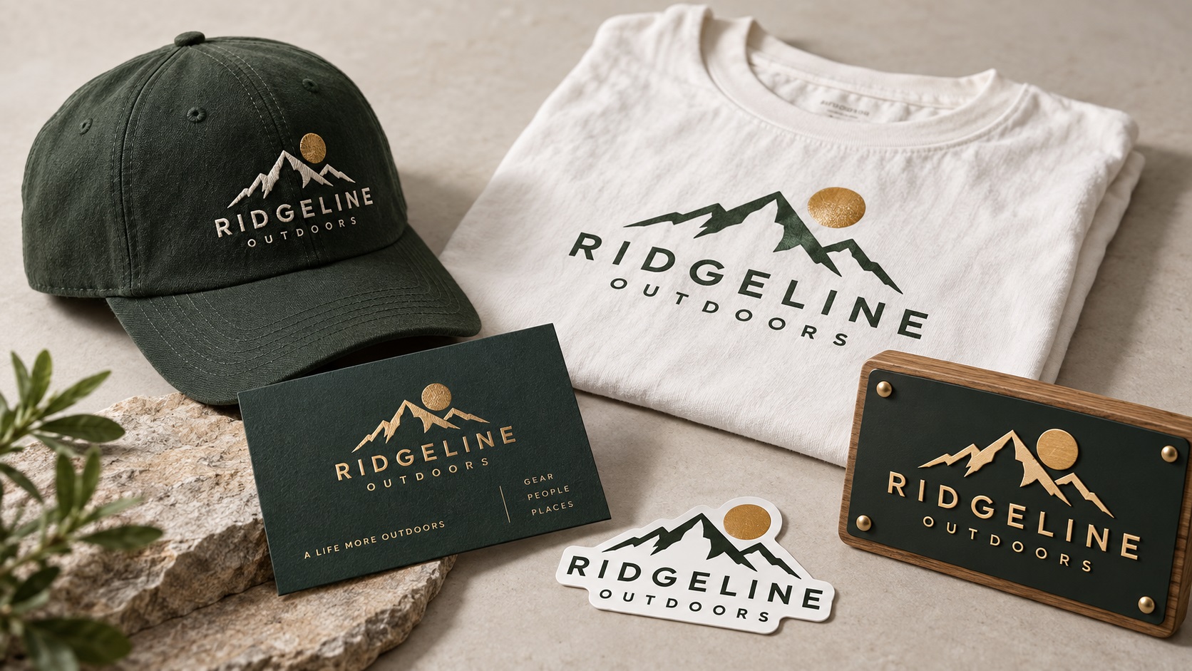
Most logos are designed for a screen. They are built at one size, tested at one size, approved on a monitor, and then pushed into the real world where they need to work on a van, a cap, a laser-cut sign, a die-cut sticker, a foil-stamped business card, and a screen-printed t-shirt simultaneously.
The gap between a logo that looks great on screen and one that actually holds up across all of those contexts is significant. And in 2026, with businesses producing across more channels than ever, logos are being pushed through more different production methods than at any previous point.
Here is what makes a logo genuinely versatile across production methods, and what to think about when you are designing or commissioning a new one.
The Core Principle: Scalability in Every Direction
A logo needs to work at a favicon and at a billboard. It needs to work in a single color and in full color. It needs to be readable when embroidered at one inch and when displayed on a wall at three feet wide.
This is not the same as being simple to the point of blandness. It means being designed with intention about which elements are core and which are decorative, and how the logo can be adapted for different contexts without losing its identity.
Design for the Hardest Production Method First
Embroidery is the most constraining production method most logos encounter. If a logo works cleanly in embroidery at a left-chest size of around 80mm wide, it will almost certainly work everywhere else.
The constraints embroidery imposes are:
- Minimum line width of approximately 1.5 to 2mm at the embroidered size
- Minimum text height of approximately 4 to 5mm for standard fonts
- No gradients
- Limited fine detail in small illustrated elements
- Color transitions need physical separation between thread areas
A logo designed with these constraints in mind will also work for screen printing, pad printing, laser engraving, vinyl cutting, and every other production method with similar or less restrictive requirements.
This does not mean the logo cannot have fine detail for large-scale applications like signage and print. It means the core mark, the version used in the most constrained contexts, should be designed robustly.
Build a Logo System, Not Just a Logo
The most production-versatile logos are actually systems: a set of related versions that share a visual identity but are adapted for specific contexts.
A typical logo system includes:
Primary mark: The full logo with icon and wordmark together, intended for large-scale use where all elements are clearly visible.
Secondary mark: A simplified or condensed version for contexts where the full primary mark is too wide or too detailed.
Icon only: The standalone symbol or monogram, used for profile pictures, small badges, app icons, embroidered cap logos, and any context where the full wordmark would be too small to read.
Single-color version: A version using only black or only white, required for laser engraving, single-color screen printing, stamps, and embossing.
Reversed version: White logo for use on dark or colored backgrounds.
Each of these should exist as a clean vector file. The system does not require radically different designs. It requires thinking at the outset about how the logo will be used and building the variants as part of the initial design process rather than retrofitting them later.
Avoid Design Choices That Fail in Production
Some common design choices create predictable problems in specific production methods:
Very thin strokes and fine lines: Look elegant on screen, fail in embroidery and can be challenging in pad printing. If thin strokes are part of the design, ensure the icon or primary mark has a bolder version for small-scale production use.
Gradients in the core mark: Cannot be reproduced in screen printing (without halftones), embroidery, laser engraving, vinyl cutting, or any solid-ink process. A logo whose primary color treatment is gradient-based needs a flat-color equivalent for every production method that cannot handle gradients.
Very small text elements: Taglines in very small text look refined in print but disappear in embroidery and become illegible at small sticker or badge sizes. Consider whether the tagline needs to appear in the core mark or whether it can be used selectively only where space allows.
Too many colors: Each color adds cost and complexity in screen printing, embroidery, and pad printing. A logo with eight colors works in digital contexts but becomes expensive and complex in production. Aim for a logo whose core identity is expressed in three colors or fewer, with additional colors as secondary elements that can be omitted in constrained production contexts.
Enclosed counters without compound path preparation: The enclosed areas in letters like A, B, D, O, P, Q, and R need correct compound path structure in the vector file for cutting and engraving applications. A logo file without this structure causes problems in vinyl cutting, laser cutting, and CNC routing.
Test Your Logo in Its Most Challenging Contexts
Before finalising a logo design, apply these practical tests:
Print at 25mm wide and check readability. If text and key shapes are still legible at that size, the logo works for small applications like badge pins and small stickers.
Convert to single color. Remove all color and view the logo in black only. If the logo still reads clearly and every element is distinguishable, it will work for single-color applications.
Reverse it on black. Place the logo as a white version on a black background. This is roughly what it will look like on a dark garment, a dark sign background, or a dark merchandise surface.
View it at large scale. Scale the logo to fill an A3 or tabloid sheet. Fine details and edges that look fine at small sizes sometimes reveal quality issues at large scale, particularly if the file has any raster elements.
What This Means for Logo Vectorization
If your existing logo does not hold up across these tests, vectorization alone may not solve the underlying design issue. Vectorization reproduces what exists. If the existing design has a very thin stroke that will not survive embroidery, the vector version will have the same thin stroke.
In these cases, the vectorization process can include a discussion about adapting the design for specific production methods, producing a cleaner version alongside the standard trace, or flagging elements that may cause problems in specific contexts.
For new logos being commissioned, sharing this article with the designer at the briefing stage gives them a clear picture of the production contexts the logo needs to survive.
Frequently Asked Questions
Does designing for production constraints mean the logo has to be boring?
No. Many of the most distinctive and enduring logos are built on bold, simple shapes because their designers understood that logos need to work everywhere. Complexity can be layered in as secondary elements, but the core mark should be robust.
We have an existing logo that fails in embroidery. Do we need a full rebrand?
Not necessarily. In most cases, an embroidery-adapted version can be created alongside the existing logo rather than replacing it. The full-detail version continues to be used for print and digital, and the adapted version is used for embroidery, badge, and small-scale applications.
Our brand identity is built on a gradient. How do we handle production methods that cannot reproduce it?
Define what the logo looks like without the gradient and make that the official flat-color version. It can coexist with the gradient version for digital use. The flat-color version becomes the production standard for all physical applications that cannot handle gradients.
Can an AI-generated logo be adapted to work across production methods?
Yes, but the AI output needs to be rebuilt as a proper vector first, and the adaptation process is part of that rebuild. When vectorizing an AI logo, the designer can simultaneously produce the single-color version, close up fine lines to embroidery-suitable weights, and set up the compound path structure needed for cutting applications.
How do I specify production versatility when briefing a logo designer?
List the production methods you anticipate needing: embroidery, screen printing, vehicle signage, laser engraving, large-format print, digital. Tell the designer the smallest size the logo will ever appear at. Ask for a logo system that includes single-color and reversed versions. Ask specifically whether the design will work in embroidery at a chest logo size.
Need artwork converted?
VectorFixer can redraw logos, convert PNG files to SVG, and prepare clean production-ready vector files.
Contact Us