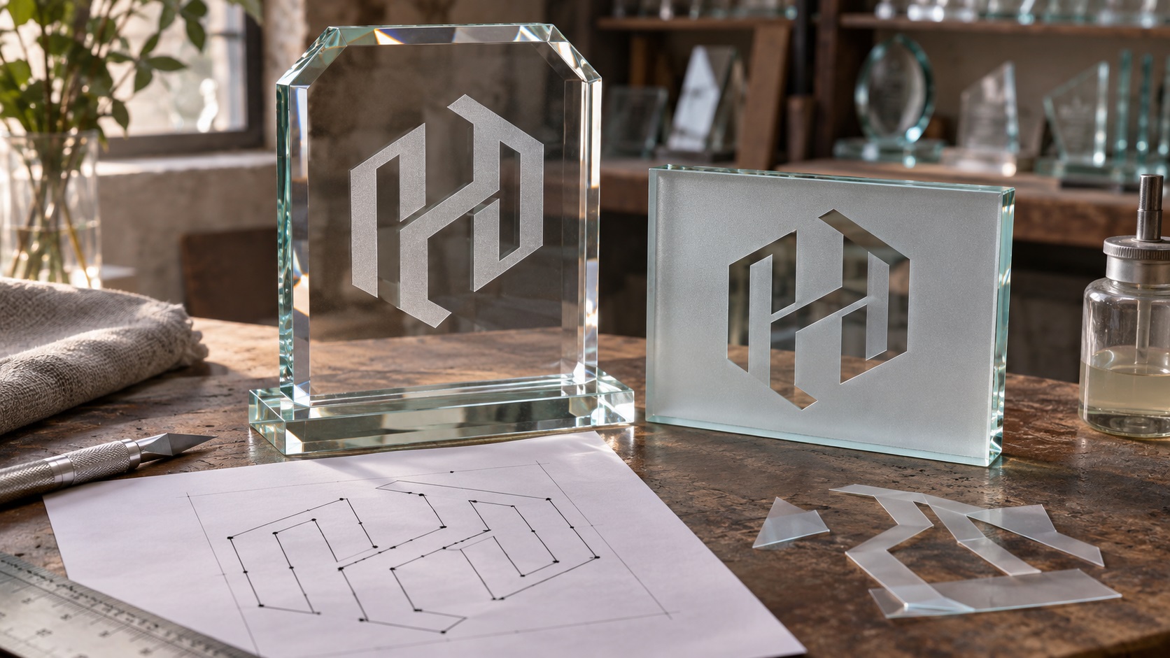
You want your company logo etched onto a glass office door, a crystal award, or a set of branded drinking glasses. The reference image looks great, so you email your PNG to the supplier.
The reply is familiar: "We need vector artwork, and some of these details may be too small for the sandblasting mask."
Glass etching and sandblasting turn a design into a physical surface finish. Unlike ordinary color printing, the result is often a frosted area where the exposed glass has been treated.
The supplier usually needs more than a nice-looking image. It needs clean shapes that can be turned into a mask or prepared for the particular etching system.
If you're ordering branded glassware, awards, or architectural glass, this guide will help you understand what to send and how to avoid surprises.
What is sandblasted glass logo decoration?
In a common masked sandblasting workflow, a protective stencil or resist is placed on the glass. Selected areas remain exposed.
The supplier uses abrasive blasting to give those exposed areas a frosted or matte appearance, then removes the mask.
That means the artwork has to define exactly which areas will be frosted and which will remain clear.
A different process, such as laser engraving or chemical etching, can have different artwork requirements and visual results.
Before preparing the file, confirm whether the vendor is actually sandblasting or using another method that it casually calls "glass etching."
A glass logo is usually about contrast, not ink color
Imagine a black-and-gold logo on your website.
A traditional sandblasted glass version will not automatically reproduce the black and gold inks.
Instead, the design may become a contrast between frosted and transparent glass.
You can still recognize the wordmark and icon, but the full-color gradient, drop shadow, and metallic effect may disappear.
That is why the most useful starting point is often a clean one-color logo.
The designer identifies the important shapes and converts them into a clear black-and-white representation of the intended etched areas.
You can retain the full-color logo for other uses. The glass version is simply a production-specific adaptation.
Why the supplier asks for a vector file
For custom masks and stencils, the supplier may cut the artwork from resist material using a machine that follows precise outlines.
Vector formats describe those outlines with editable paths and curves.
Common supported formats include AI, EPS, SVG, and a true vector PDF, depending on the shop.
A PNG or JPG is a picture made from pixels. It can still be useful as a visual reference, but it may need to be traced or redrawn before the stencil can be cut accurately.
Some specialized suppliers will convert raster artwork for an additional fee.
Others require vector files before accepting the order.
The important point is that clean geometry reduces ambiguity during mask preparation.
Why saving a PNG as SVG is not enough
An SVG can contain genuine vector shapes. It can also contain an embedded PNG or a rough automatic trace.
Changing the extension does not create proper cut paths.
Suppose your logo was copied from a website and has blurred edges. An automatic tracer might generate dozens of tiny paths around the blur.
The resulting SVG may look acceptable at normal size but contain extra cut lines and microscopic fragments.
For a sandblasting mask, that can create difficult weeding, unexpected openings, or uneven edges.
A clean manual redraw can produce simpler paths that follow the intentional logo shapes.
If your only source is a fuzzy PNG or an old JPG, contact VectorFixer and include the glass supplier's specifications so the artwork can be rebuilt for the intended process.
Positive versus reverse etching
This is one of the most important decisions to clarify.
Frosted logo on clear glass
The lettering and icon are the treated, frosted areas. The surrounding glass stays transparent.
This is often the effect people imagine for office doors, awards, and drinkware.
Clear logo inside a frosted panel
The background is frosted while the lettering and icon remain transparent.
This can create a striking sign or privacy panel.
But the mask geometry is effectively reversed.
If your supplier assumes the wrong version, the final product may look like the opposite of what you approved.
Send a simple proof marking frosted and clear areas. Do not rely only on black and white unless the vendor explains how its file convention works.
What happens to the holes inside letters?
Letters such as O, A, B, D, and P have open areas, commonly called counters.
These openings are important to readability.
If the vector artwork is built by placing a white shape on top of a black letter, the design may look correct on screen without having a true hole in the cut geometry.
For a stencil, the actual shape structure matters.
A designer may need to make compound paths or subtract the inner shapes so the cutter interprets the artwork as intended.
The supplier also needs to know which small regions of stencil material must remain in place.
Do not simply weld every shape together without checking what should stay clear.
Why overlapping shapes can cause problems
Many logos are built from separate geometric objects that overlap visually.
For example, a monogram may use two thick strokes arranged to look like one connected symbol.
If the paths remain separate, the stencil cutter might follow internal overlap boundaries that should not exist in the finished mask.
That creates extra cuts and complicates weeding.
For a one-color design that should be a solid area, those touching shapes may need to be combined into a clean outline.
However, separate shapes may be intentional when they represent clear gaps or different treatments.
Inspect the logo in outline or wireframe view and compare it with the approved appearance.
Small letters and thin lines are the first details to check
A logo might work at ten inches wide on a glass office door but fail at one inch wide on a small drinking glass.
As the design becomes smaller, the narrowest strokes and spaces shrink too.
Very thin pieces of masking material may be difficult to cut or remove cleanly. Tiny exposed gaps can produce weak or inconsistent frosted marks.
There is no universal minimum line width that works for every blasting shop, stencil material, glass type, and design size.
Ask the supplier for its actual minimum stroke width, letter height, and gap recommendations.
It is better to confirm those limits before approving a purchase order.
Why script logos can be tricky
A handwritten wordmark may contain thin connectors, overlapping swashes, decorative loops, and delicate dots.
These can be beautiful in a printed logo.
For a cut stencil, each little shape must survive the stencil-making and application process.
If a thin connector breaks, the entire letter can change appearance.
The supplier may suggest thickening specific strokes or simplifying a flourish.
A production variation should preserve the recognizable script rhythm rather than replacing the whole wordmark without approval.
If the script is central to your brand, show the proposed changes at the actual finished size.
How curved glass changes the artwork
A large flat office panel and a round drinking glass are not the same surface.
A stencil must conform to the object to seal the areas that should remain protected.
A wide logo placed around the curve of a glass tumbler may be difficult to apply without wrinkling or lifting.
A curved surface can also change how the final logo looks from the front because the design wraps around the object's circumference.
For drinkware, ask the supplier for the recommended decoration width and height for the exact product model.
A compact centered icon may work better than a long horizontal slogan wrapped too far around the glass.
Never assume you can reuse the dimensions from a flat sign or an unrelated glass shape.
Choose the final etched size before you simplify
The same logo can have several production versions.
For an office partition, the full company name and emblem may be visible at a comfortable size.
For a small award, it may be better to use just the icon and short company name.
For a glass bottle, a compact mark may be most practical.
Start with the actual finished dimensions.
Then evaluate which parts remain legible.
If you make the changes while zoomed in on a screen, you can easily overlook how small the finished details will be.
Why a photograph of a previous etched logo helps
Sometimes the brand already has an older glass sign or gift item, and you want a new batch to match.
A clear photograph can show the intended proportion and frost-versus-clear treatment.
It may also reveal which fine details were simplified in the earlier production.
But a photo can distort shapes through camera angle, reflections, or curved glass.
Use it as a reference, not as proof that the underlying geometry is exact.
Ask whether the previous supplier still has the original vector artwork or stencil file.
Recovering the approved source is often more efficient than rebuilding it from the physical object.
What if you only have an AI-generated logo?
AI-generated logo images sometimes include soft shadows, gradients, reflective materials, or lettering that only resembles real text.
Before creating a glass etching version, confirm the exact business name and approved symbol.
Then strip the design back to intentional shapes.
A two-color logo may become one set of frosted regions, while a translucent glow must be replaced by an approved solid contour.
Automatic tracing can preserve malformed letters as scalable malformed letters.
For a premium sign or award, carefully reconstructed typography is often more reliable than accepting a complex auto-traced result.
Glass awards need a different emphasis from storefront panels
A glass award may include a recipient name, date, achievement, and the organization's logo.
The company logo is just one part of the composition.
If the glass is small, the recipient's name may need priority over a long corporate tagline.
Ask the award maker to provide a proof showing the full inscription at its actual size.
Make sure the logo is not so large that it crowds the important award details.
For high-volume awards, confirm whether personalization changes the production method or turnaround time.
The sign shop or award supplier should control the final placement and production file once the branding source is approved.
Will the etched logo always look white?
Frosted glass can appear white or gray against a dark background, but its appearance changes with lighting, viewing angle, and the surface behind it.
On a white wall, a lightly frosted logo may have less contrast.
On dark glass or against a darker background, the same frost can look brighter.
The depth and texture of the treatment can also affect the visual result.
Ask to see a material sample in a setting similar to where the final product will be used.
This matters especially for transparent doors with bright light behind them.
What about logos on glass doors?
An etched company name on a glass door can contribute to an attractive office entrance.
But decorative branding and legally required visibility markings are different considerations.
If the door needs safety manifestation, visibility bands, or other compliant markings, have the glass and signage contractor confirm the applicable requirements.
Do not assume the logo alone fulfills those rules.
Also check door hardware, clearances, sight lines, and any area where the film or treatment should not be placed.
The final installation layout should be prepared with measurements from the actual door or panel.
Preparing the vector artwork step by step
A practical workflow is:
- Obtain the original logo master if available.
- Confirm the exact product and intended etched size.
- Decide whether the logo or the background will be frosted.
- Convert the approved design into clear one-color geometry.
- Remove accidental shadows, gradients, and raster effects.
- Check the letter shapes and spacing.
- Inspect the holes inside letters and symbols.
- Combine overlapping shapes only where appropriate.
- Remove unnecessary points, specks, and stray paths.
- Confirm the minimum details with the supplier.
- Export a true vector file in the requested format.
- Review a final proof marking frosted and clear regions.
For critical jobs, a small sample or test etch can reveal problems a digital proof cannot show.
What should you send the sandblasting supplier?
Provide a clear handoff package:
- A clean vector logo master.
- The intended one-color etched version.
- A visual proof showing the desired finish.
- Exact logo width and height.
- Product model or glass panel dimensions.
- Whether the logo is frosted on clear glass or clear inside a frosted field.
- Any required text or inscription.
- A note identifying which details may be simplified.
- A reference photograph, where helpful.
- The supplier's preferred file format and template.
If you need work on both sides of a glass panel or on curved glass, raise that early. The vendor may have positioning and orientation requirements.
Common mistakes that delay glass logo orders
Sending only a screenshot
It may be enough for a quote but not suitable as the final cut-stencil file.
Keeping very small details
Thin lines and tiny type can fail when the mask is cut or applied.
Forgetting to specify frosted versus clear
The same black-and-white artwork can be interpreted in opposite ways if the convention is not confirmed.
Using background-colored shapes to fake holes
A stencil cutter needs correct geometry, not simply an image that looks right.
Ignoring the curve of the glass
A long logo may be difficult to apply or view on a curved tumbler.
Assuming one file suits every product
A large flat panel and a small award may require separate approved sizes or simplified versions.
Frequently asked questions
What file format is best for sandblasted glass logos?
Many suppliers prefer AI, EPS, SVG, or a true vector PDF, depending on their stencil-cutting workflow. Confirm the accepted format before sending.
Can you sandblast a logo from a PNG?
Some shops can convert a PNG or use it as a reference, but the mask may need clean vector paths. Additional artwork preparation can cost extra.
Does a sandblasted logo keep its original colors?
Traditional frosting changes the glass surface rather than reproducing a full-color logo. You may need a solid one-color version or a different decoration method for colored artwork.
Why do the holes inside letters matter?
Those clear or frosted openings are part of the stencil geometry. Incorrect compound paths or overlaid objects can change how the mask cuts.
Can a logo be etched onto curved drinking glasses?
Yes, depending on the product and decoration area. The supplier should confirm the workable size and how the stencil fits the surface.
Do I need to redesign the entire logo?
Usually not. The approved mark may only need a simplified one-color version with cleaner paths and stronger small details.
Keep the logo recognizable when it becomes frosted glass
Sandblasted glass works best when the design can be expressed as clear, deliberate shapes that a supplier can turn into a reliable mask.
Start with the real product and finished size, decide which areas should be frosted, and prepare a clean vector version that preserves the important parts of the brand.
If you only have a blurry PNG, an old PDF, or a messy auto-traced file, contact VectorFixer with the artwork and your supplier's requirements. A clean vector redraw can make the design easier to prepare for glass signs, awards, and branded glassware.
Need artwork converted?
VectorFixer can redraw logos, convert PNG files to SVG, and prepare clean production-ready vector files.
Contact Us