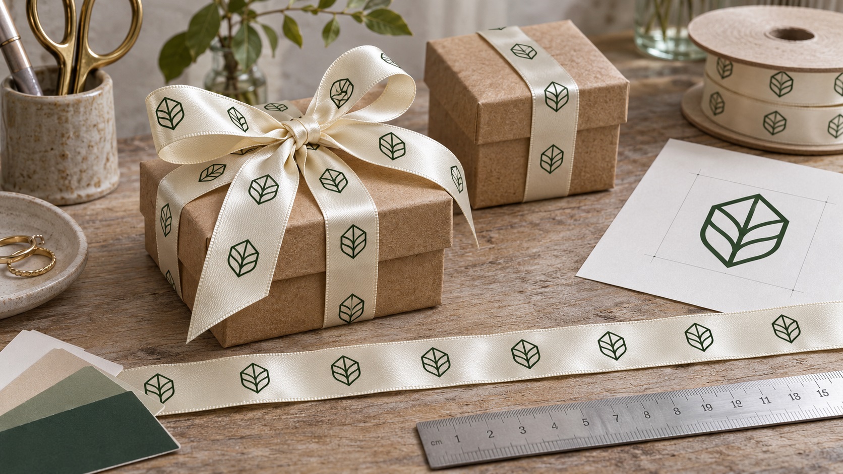
A boutique wants satin ribbon printed with its logo for gift boxes. The logo looks sharp on its website, and the ribbon supplier accepts custom artwork. So the owner uploads a PNG and chooses a narrow ribbon.
The proof comes back with cramped lettering, a logo that nearly touches the ribbon edges, and a repeating pattern that disappears when the ribbon is tied into a bow.
The problem is rarely just resolution. Custom ribbon has two design constraints at once: a very narrow printable width and a repeated pattern along a long, flexible material.
Getting the logo right means preparing the shapes, spacing, orientation, colors, and repeat layout for the actual ribbon and the way it will be used.
Here is a practical guide for gift shops, jewelry brands, bakeries, packaging suppliers, event businesses, and anyone ordering custom printed satin ribbon.
Why logo artwork for ribbon is different from artwork for a box
A printed product box gives you a broad, relatively flat surface.
A ribbon is long and narrow. It may fold, twist, curve around a parcel, or form loops in a bow.
A logo that looks balanced on a 100 mm-wide label can become too detailed on a 16 mm ribbon.
Even when the print process can reproduce the letters, the design may be hard to read once the ribbon is tied.
That is why ribbon artwork needs to account for width, safe area, repeat spacing, and real-world placement.
Start with the exact supplier and ribbon product, not the screen mockup.
What kind of ribbon are you ordering?
Not all ribbons print or look the same.
Satin ribbon
Satin has a smooth, often glossy appearance. It is popular for premium gift packaging, jewelry boxes, events, and presentation products.
The sheen can make subtle tones look different as the ribbon turns in the light.
Grosgrain ribbon
Grosgrain has a more visible ribbed texture. It can feel structured and may suit branded wrapping, tags, and certain retail packages.
That textured surface can affect the appearance of delicate print details.
Polyester and other printable ribbon materials
Some suppliers use polyester ribbon with different finishes and printing processes. Others offer recycled materials or specialty foil-decorated products.
The words "custom printed ribbon" do not identify a single manufacturing method.
Ask about the actual fabric, printing process, print-side options, and whether the finish is suitable for your intended use.
Decide the ribbon width before scaling your logo
A supplier may offer widths such as 10, 15, 16, 20, 25, or 38 mm, among others.
The physical width limits how tall the design can be.
If you create a design for a wide ribbon and later switch to a narrow one, the supplier may have to shrink the logo and all its lettering.
That can make fine lines or taglines unreadable.
Choose the width based on the package and intended presentation first. Then scale the artwork to fit within the manufacturer's printable area.
The ribbon's stated width is not automatically the same as the safe printable width.
Why safe margins matter on a narrow ribbon
Printers usually need a little clearance between important artwork and the material edges.
For example, noissue's published template for one 16 mm recycled satin ribbon specifies keeping important design content 3 mm away from each edge.
That is a product-specific template, not a universal rule for every ribbon manufacturer.
It shows why a brand name that appears to fit across the entire ribbon might still be too tall.
If your chosen ribbon is 16 mm wide and its template requires 3 mm on both edges, the safe central artwork area is only 10 mm.
For narrow ribbon, a few millimeters make a major visual difference.
Use the template supplied for the exact product you plan to buy. Avoid guessing margins from another vendor's website.
What file format should you send?
For clean brand logos and repeating wordmarks, a true vector file is usually the most flexible source.
Depending on the printer, suitable formats may include:
- AI
- EPS
- Vector PDF
- SVG, if supported by the artwork workflow
A vector file contains editable shapes and paths instead of pixels fixed at one resolution.
This helps the supplier resize the logo, outline text, separate colors, and align the design within a repeat template.
Some printers also accept high-resolution raster images. That can be fine for certain full-color processes, provided the size and resolution are correct.
But for small solid-color logos, a clean vector master is especially helpful.
A PDF is not automatically vector artwork. A PDF containing a placed JPG may still need a redraw.
Why a transparent PNG may not be enough
A PNG can contain a perfectly useful picture of your logo. But if it came from a screenshot or an old compressed file, the edges may be soft or jagged.
Shrinking that image onto satin can make the smallest parts merge.
If the ribbon printer needs one-color shapes or plate-based printing, it may want actual vector paths.
If you cannot locate the original source, contact VectorFixer with the best image you have and the ribbon supplier's artwork requirements. A clean redraw can create reusable paths without redesigning the brand.
How small is too small for ribbon text?
This depends on the ribbon width, printing process, fabric, and typeface.
A tiny wordmark can look readable when magnified on your screen but become unclear on the finished ribbon.
The safest approach is to follow the exact supplier's minimum text, line, and gap specifications.
For example, one noissue ribbon artwork template recommends text at least 5 points and notes limits for fine strokes and small gaps. Those are guidelines for that particular product and print method.
A 5-point font is not automatically suitable for every font, every machine, or every satin finish.
Long slogans, thin serif text, and elaborate handwritten scripts may need to be removed or replaced with a simpler approved variation.
When in doubt, ask for an actual-size proof and a physical sample if available.
The repeat pattern is as important as the logo
Most custom ribbons repeat the artwork along the length of the roll.
You may have a sequence like this:
Logo | gap | Logo | gap | Logo
But the length of each repeating section affects how the design appears after the ribbon wraps around a box.
Too much gap can leave entire bow loops blank.
Too little gap can make the logo look crowded.
A logo may also be cut off awkwardly at the end of a printed length.
Different suppliers use different repeat templates. Some set the repeat at a fixed production length, while others let you choose a spacing distance.
Ask what the manufacturer controls and what you can specify.
How far apart should the logos be?
There is no ideal repeat spacing for every ribbon.
It depends on the size of the mark, how long the ribbon will be cut, and whether you want a subtle or busy branded look.
For small gift boxes, frequent repeats might help ensure that at least one logo is visible on the wrapped package.
For wide ceremonial ribbon, a longer repeat may feel more spacious.
Some suppliers offer default spacing unless you give explicit instructions.
Ribbon Warehouse, for example, describes a default repeat spacing on certain personalized ribbon products and lets customers request an alternative layout.
That is why a note such as "repeat the logo every few inches" may not be precise enough.
If placement matters, state the preferred distance using the same measurements as the supplier's template.
Think about the final bow, not just the flat ribbon
The way a ribbon is tied can hide much of the printed artwork.
One logo might land on the underside of a loop. Another might end up partly inside the knot.
Before approving production, mock up the intended use.
You can print a rough paper strip at the same width, mark where the repeats will appear, and tie it around a similarly sized box.
The paper test will not match the movement or sheen of satin, but it can reveal whether the logo spacing is sensible.
For a premium retail packaging order, ask whether the manufacturer can supply a small physical printed sample.
A flat digital proof alone does not guarantee that the bow will display the logo the way you imagined.
Should the logo read in one direction or alternate?
This is a design choice worth making early.
A logo repeated in the same orientation may read correctly along one direction of the ribbon.
But if the ribbon twists, folds, or wraps around a box, the wordmark may appear upside down from certain angles.
Some suppliers can alternate the orientation of repeated artwork. Others may use a standard continuous layout.
Do not assume the manufacturer will flip every second logo for you.
Request a clear proof showing the sequence and direction of the repeated design.
For packaging where the ribbon is always tied in one specific way, the right layout may be different from ribbon intended for general gift wrapping.
Single-sided versus double-sided printing
Some custom satin ribbon products are printed on only one face.
The back may remain the base ribbon color.
That can be fine for a flat band around a box, but a loose bow exposes both sides.
If a customer wants the logo visible from every angle, ask whether double-sided printing is available and how it affects price and artwork setup.
Double-sided printing can also introduce registration or alignment considerations, depending on the supplier's method.
The manufacturer should explain how the two sides will align.
A second printed side does not automatically guarantee that every logo will face outward once the ribbon is tied.
One-color printing versus full-color printing
Some suppliers specialize in one-color solid printing, while others offer full-color processes capable of photographs or gradients.
The right file preparation depends on which one you choose.
One-color ribbon logos
A solid-color vector master usually makes artwork setup easier.
Gradients, soft shadows, and photographic textures may need to be converted to deliberate solid shapes.
Full-color ribbon printing
The printer may be able to reproduce more of your original artwork.
However, the ribbon color, material, and printing method can change the result.
Ask for supported color mode, minimum resolution for raster imagery, and available proofing options.
Metallic printing or foil effects
Gold-looking artwork on a screen is not automatically metallic foil in production.
Some suppliers offer special metallic finishes; others print standard ink approximations.
If the metallic appearance matters, specify the actual production finish instead of relying on a digital gradient.
How should the brand colors be supplied?
Provide the approved brand references, ideally using the color system your manufacturer accepts.
Some printing workflows ask for CMYK artwork. Others request a specific spot-color or Pantone reference.
A screen HEX color can guide a supplier, but it is not always an exact prediction of the finished ink on satin.
If the packaging uses multiple vendors for boxes, tissue paper, stickers, and ribbon, consider approving physical samples to check the combination.
The color does not have to look identical under every lighting condition to be consistent, but unexpected mismatches can be avoided through proper proofing.
Why the smallest details often need to be removed
A logo might include an intricate emblem, a business name, and a long tagline.
On a narrow ribbon, the tagline can become a thin line of unreadable shapes.
Tiny accent dots and hairline strokes may also be at risk.
A better ribbon variation might keep:
- The main brand name.
- A simple emblem.
- One approved decorative border.
- A short repeat pattern with clear spacing.
You can still use the full logo on the box, label, product tag, and website.
The ribbon should reinforce the brand, not try to carry every detail.
Do fonts need to be converted to outlines?
Many print suppliers require final text to be outlined.
That means converting editable letters into vector paths so a missing font cannot change the design when the file is opened.
For custom lettering, it can also preserve the exact shape of the approved wordmark.
Always save an editable master first.
And remember that outlining text does not make it larger or improve tiny spacing. It simply defines its shapes more reliably.
If a supplier rejects the text for being too small, the artwork still needs to be adjusted.
How to prepare a repeat file step by step
A practical preparation process looks like this:
- Select the actual ribbon product, material, and width.
- Download the manufacturer's artwork template.
- Choose the approved logo variation for narrow use.
- Confirm the print process and available colors.
- Place the vector artwork inside the specified safe area.
- Resize the lettering while preserving its proportions.
- Inspect thin strokes, counters, and spaces at actual size.
- Create the requested repeat along the length.
- Check the logo orientation and spacing.
- Convert fonts to outlines if required.
- Export in the format requested by the manufacturer.
- Review the vendor's final proof before authorizing production.
Do not add crop marks, bleed, or other output marks unless the supplied ribbon template asks for them.
Some ribbon artwork workflows differ from standard poster or brochure printing.
Example: custom ribbon for a jewelry box
Imagine a jewelry brand called "Aster & Pine" ordering cream satin ribbon with its dark green logo.
The original logo contains a delicate floral emblem, a wordmark, and the line "Fine Jewelry, Thoughtfully Made."
The brand plans to tie the ribbon around small square gift boxes.
A useful order-ready variation could:
- Keep the "Aster & Pine" wordmark.
- Simplify the floral symbol.
- Remove the long tagline from the narrow ribbon.
- Use a clean one-color dark green logo.
- Place repeats so the name appears on at least part of the visible bow.
- Keep the text within the exact manufacturer's safe area.
- Test the layout on a box before approving the roll.
The result will usually communicate the brand more clearly than shrinking the full multi-line logo to fit.
Common mistakes when ordering branded ribbon
Treating ribbon width as the full printable area
Important artwork needs clearance from the edges where the supplier requires it.
Sending an old screenshot instead of vector paths
A blurry image can make tiny curves and letters harder to reproduce.
Forgetting about repeat spacing
A great-looking single logo can become an awkward pattern if the distance between repeats is wrong.
Ignoring the bow
Ribbon bends and twists. A flat proof does not show every visible surface on the final package.
Assuming metallic gold ink and gold foil are the same
They are different visual and manufacturing treatments.
Using an oversized tagline
Small text that does not read at actual size usually should not be forced onto the ribbon.
Approving the wrong production version
Confirm the proof shows the correct logo, ribbon width, colors, orientation, and repeat spacing.
What should be included in the supplier handoff?
Send a compact package with:
- The clean vector logo file.
- A color reference or approved artwork proof.
- The chosen ribbon material and width.
- The intended print color and ribbon color.
- The exact wording and spelling.
- Whether printing is single-sided or double-sided.
- The repeat distance or manufacturer-approved repeat layout.
- A note about logo orientation.
- Any requested minimum spacing or edge clearance.
- The quantity, order unit, and required date.
If the ribbon is for a particular box, include the box size and a photograph of the intended bow style.
This allows the supplier to evaluate the finished product, not just the flat artwork.
Frequently asked questions
Can you print a logo on narrow satin ribbon?
Yes, many manufacturers offer narrow ribbon printing. The design needs to fit the product's safe area and meet minimum text and line-size requirements.
Is a PNG good enough for custom ribbon printing?
Some suppliers accept high-resolution PNGs for certain methods. For solid-color logos and small lettering, a genuine vector master is often the better production source.
What is the best file format for a ribbon logo?
The answer depends on the supplier, but AI, EPS, and vector PDF are common choices. Some printers also accept SVG.
Can custom ribbon have a repeating logo?
Yes. Many suppliers offer repeated artwork along the roll. Confirm the repeat length, spacing, and orientation before approval.
Should I put my full logo and tagline on the ribbon?
Only if both remain clear at the finished size. A simplified wordmark or emblem often works better on narrow ribbon.
Can satin ribbon be printed on both sides?
Some suppliers offer that option, while others print only one side. Check the specific product before creating your final file.
Make the ribbon part of the packaging system
A well-prepared logo on satin ribbon can make everyday packaging feel consistent and intentional.
The most important factors are not just sharp resolution. They are clean paths, readable details, safe margins, smart repeat spacing, and a proof that reflects how the ribbon will actually be used.
If your ribbon supplier says the logo is blurry, too detailed, or not in a proper vector format, contact VectorFixer with the existing artwork and supplier template. A clean redraw or simplified production variation can make the logo more suitable for your next packaging order.
Further reading
- Ribbon Warehouse: Personalized ribbon artwork and repeat spacing
- LaserBloom Studios: Custom printed ribbon options
- ELAPACK: Ribbon artwork, repeat spacing and packaging
Need artwork converted?
VectorFixer can redraw logos, convert PNG files to SVG, and prepare clean production-ready vector files.
Contact Us