You have a logo ready for a charity fundraiser, school event, product launch, or customer giveaway. You want it on silicone wristbands, so you upload the same PNG you use on your website.
The supplier replies with an artwork question: "Do you want the logo printed, debossed, or embossed?"
You might also be asked to send vector artwork, simplify the small text, or approve a new wristband layout.
These are not arbitrary requests. A silicone wristband is a narrow, curved product, and the decoration process determines which parts of your logo will reproduce accurately.
This guide explains the main wristband styles, what artwork each needs, and how to prepare a logo before ordering hundreds of bands.
Why silicone wristbands need their own logo artwork
A website header can display an intricate logo at almost any convenient size. A wristband has a fixed physical width, limited space around the circumference, and a rounded surface.
Even if your original file is sharp, the complete business name, tagline, icon, and decorative details may not all fit clearly.
A production-ready design must answer three questions:
- Which decoration method will be used?
- How much printable or moldable space is actually available?
- What details can remain readable at the final size?
It is often better to make a simple, approved wristband variation than to shrink every component of the full brand logo.
Printed, debossed, and embossed: what's the difference?
These words describe different physical results.
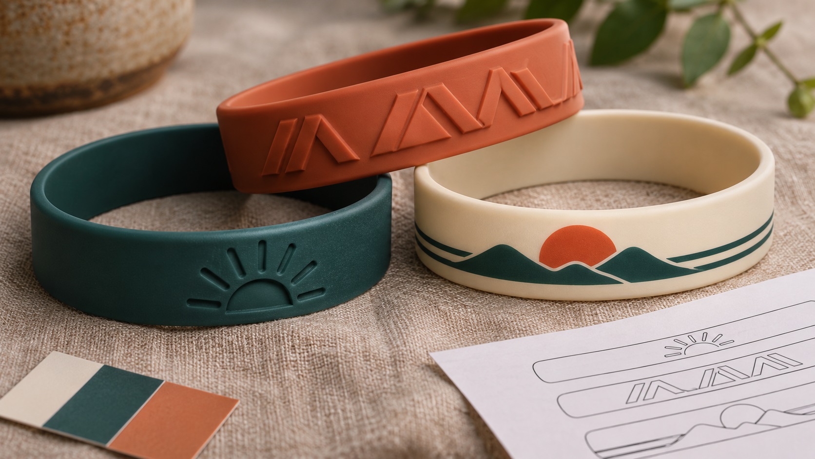
Printed silicone wristbands
Ink is applied to the surface of the band. Depending on the supplier's process, printing may allow contrasting colors, more delicate shapes, or multiple-color artwork.
Printed graphics are helpful when the logo needs its familiar color contrast.
However, print durability, available colors, and detail limits vary by ink system and supplier. Ask for care guidance and a sample where necessary.
Debossed silicone wristbands
The lettering or logo is recessed into the silicone.
On a plain debossed band, the mark is the same material color as the band and is seen through light and shadow.
This can create a subtle tactile look, but delicate letters may lose definition if the recessed features are too small.
Debossed and color-filled wristbands
The recessed areas can be filled with a contrasting color where the supplier offers that option.
Color filling increases contrast, but the grooves need to be wide and open enough to hold the chosen fill cleanly.
A narrow letter may look fine in the computer proof and become difficult to fill consistently.
Embossed silicone wristbands
The design is raised above the surrounding band surface.
This creates a tactile logo without requiring contrasting print colors.
Fine raised details still need sufficient physical width and separation. A complicated raster image cannot simply be molded with all its soft gradients intact.
Not every provider offers every method, so make your design decisions based on the specific supplier's options.
Which wristband style is best for a business logo?
Think about what matters most to the design.
If you need recognizable contrasting color: Printed or color-filled designs may be worth considering.
If you want a subtle all-one-color effect: Plain debossing or embossing can look appropriate.
If the logo has bold simple lettering: Several methods may work.
If the design contains very fine details or a photograph: Ask whether a specialty full-color printing method is available instead of assuming molded methods will reproduce it.
If durability is your top priority: Ask the manufacturer about its tested performance for the actual decoration method. A general claim about silicone does not guarantee that every ink or fill will behave identically.
The final choice should be made after reviewing a sample or a proof at actual size.
What logo file should you send?
For sharp logos, true vector artwork is usually the most flexible source.
Common vendor-supported formats include AI, EPS, and vector PDF. Some manufacturers also accept SVG or high-resolution raster files for printing.
A vector file contains editable paths and shapes. This makes it easier to adjust letters, separate color areas, and scale the design without introducing pixelated edges.
A PDF that only contains a JPG is not a true vector logo. Likewise, placing a PNG inside an SVG does not rebuild the logo into clean paths.
If the supplier is making molded lettering, a clean vector is particularly useful for creating the production shapes.
If you only have a screenshot or old low-resolution image, a manual redraw may be needed before the design is approved.
Why small text is usually the first problem
A common wristband request includes a large business name on the front and a tiny web address or slogan on the back.
The full message can look readable in a zoomed-in mockup, but the actual band may be only around half an inch wide.
When the design is reduced, the interior openings in letters such as a, e, o, and p can become difficult to distinguish.
Narrow script fonts and thin serif lettering may be particularly risky.
This applies to both printed and molded designs, although the exact reasons differ.
The best fix may be to simplify the wording rather than enlarge every piece of text until it overlaps.
Is there a minimum letter size for silicone wristbands?
There is no universal minimum that applies to every vendor, mold, wristband width, and printing method.
Some wristband manufacturers publish working guidance for tiny lettering and strokes. For example, a vendor may recommend starting around 6-point text or using lines approximately 0.35 mm wide in certain molded designs.
Those are supplier-specific review guidelines, not a guarantee that any 6-point font or 0.35 mm stroke will reproduce correctly.
Actual results depend on the font, available spacing, mold construction, printing or color-filling process, and finished band size.
Ask your chosen supplier for its minimum text height, stroke width, and gap requirements, and request an actual-size proof.
Why letter spacing and open areas matter
A logo can have letters that are technically large enough but still be hard to reproduce because the spaces between them are too narrow.
This is especially true for bold letters that sit close together.
For recessed designs, the mold must form separate grooves.
For embossed designs, the raised shapes need clear separation.
For printing, tightly spaced characters can appear crowded or become harder to read on a curved band.
Check the smallest negative spaces, not just the outer width of the logo.
If the business name is long, consider splitting it into two sides or using an approved shortened version.
What happens to gradients and shadows?
A digital logo might contain an orange-to-yellow gradient, soft drop shadow, or glossy effect.
A plain molded one-color band cannot directly reproduce a smooth photographic gradient as physical depth.
The designer may need to turn the gradient into one solid shape, define separate color regions, or use a printing method that supports the effect.
This is one reason a brand should have a clean one-color version.
The wristband artwork can preserve the logo's basic silhouette and recognizability without trying to copy every screen effect.
Do not approve color simplification without checking how it affects the identity.
Prepare a single-color version first
Even if you eventually order a two-color printed wristband, a solid one-color vector version is a useful starting point.
It helps reveal whether the logo depends too much on shading or texture.
To prepare it:
- Identify the main icon and wordmark.
- Remove unintended background objects.
- Convert the important text to paths in a production copy if needed.
- Simplify gradients into approved flat areas.
- Check the openings in letters.
- Remove tiny decorative pieces that would not survive manufacturing.
- Confirm the design remains recognizable.
Keep the original full-color logo separately.
A production variation should supplement the brand master, not overwrite it.
How do you lay out the logo around the band?
A wristband is not the same as a flat rectangular banner.
The available decoration area depends on its circumference, width, size, and the chosen placement.
Some suppliers offer front-only messaging, front-and-back designs, continuous wording around the band, or inside messages.
These options do not necessarily provide the same number of usable characters.
The manufacturer may reserve clear space near a mold seam or other production feature.
Do not stretch a logo over an entire circumference until it becomes distorted simply to fill the template.
Use the actual vendor template and request a wraparound preview that shows where the design begins, ends, and meets.
What about children's and adult wristband sizes?
Different band sizes provide different amounts of usable space.
A long slogan that fits an adult band may not fit a smaller children's size with the same font and spacing.
If you're ordering multiple sizes, ask whether the same artwork can be reused or whether each size needs an approved layout.
Also ask whether the visual center of the design will remain in the correct place when worn.
A design that is perfectly centered in a flat file can feel unbalanced if the manufacturer places it across the seam or around a curved section.
Why color codes matter, but samples matter more
If you want a specific band color, provide your approved brand reference, such as a Pantone or another manufacturer-supported color specification.
That helps the vendor understand the intended shade.
But screen previews are approximations, and material colors can vary.
Some manufacturers also offer swirl, segmented, or multicolor wristbands, where the exact position of each color may vary with production.
For a large order or a campaign where exact color matters, request a physical color sample or a preproduction sample when available.
Do not rely solely on the appearance of the band on a mobile screen.
Do you need to convert the font to outlines?
For a final vector file, converting text to outlines can help keep the approved letterforms consistent when the manufacturer opens the design.
It is especially valuable when your wordmark uses a custom or uncommon typeface.
Keep an editable master before you do this. Outlined text becomes geometry rather than ordinary editable typing.
Outlining also does not magically fix thin strokes or narrow gaps.
The designer may still need to adjust the letterforms at the final size to meet the molding or printing limits.
What if the supplier says your logo is too complicated?
Ask for a specific explanation.
"Too complicated" could mean the lettering is too small, the negative spaces are too narrow, the logo has unsupported gradients, or the file is raster-only.
Each problem has a different solution.
A detailed icon may need simplification for molded wristbands, while a printed version might reproduce more of it.
If only the outer edges are rough because of an old JPG, manually redrawing the logo into vector paths may be enough.
If the original design includes dozens of tiny text elements, a wristband-specific layout could be better than asking the supplier to force them into the mold.
The important distinction is between fixing file quality and changing the logo's design.
A practical example: charity fundraiser wristbands
Suppose a community organization wants 500 blue wristbands with a small sun icon and the phrase "Together We Rise."
The original logo also includes a long charitable mission statement below the name.
For a narrow band, the mission statement may not be readable.
A sensible preparation process could be:
- Choose printed, debossed, embossed, or filled decoration.
- Select the exact wristband width and sizes.
- Keep the sun icon and short phrase as the primary mark.
- Remove the tiny mission statement from the wristband version.
- Prepare clean vector artwork with approved colors.
- Place the wording using the supplier's template.
- Inspect the proof at actual size.
- Confirm the band size, placement, quantity, and color.
- Approve a preproduction sample if the order warrants one.
The organization still uses its full logo on posters and websites. The wristband communicates the message clearly with fewer elements.
What should be in the supplier handoff package?
Send more than a logo screenshot.
A useful handoff includes:
- The cleanest vector logo available.
- A PNG reference showing approved appearance.
- The exact words and spelling.
- Selected wristband style.
- Adult, youth, or other required size.
- Preferred band width.
- Band and print/fill color references.
- Whether the logo should appear on one side, both sides, or continuously.
- Which elements may be removed or simplified.
- The supplier's own template and specifications.
- The quantity and required delivery date.
Ask the supplier whether setup, mold work, proofs, samples, and reorders are included in the quote.
These are practical business questions, not only design details.
What should you check in the digital proof?
Before approval, look for the following:
Correct spelling: Names, slogans, phone numbers, and URLs must be exact.
Actual size: Judge readability at the intended physical dimensions.
Spacing: Letters and interior holes must remain visibly separated.
Positioning: The artwork should not cross a seam or sit awkwardly when worn.
Method: The proof should show printed ink, recessed detail, or raised molding as ordered.
Color: Check the approved references, while remembering that screen previews are not physical samples.
Back design: If you ordered front-and-back messages, confirm both views.
Version: Make sure the proof uses the final approved logo, not an older screenshot.
For bulk production, a sample can reveal problems a digital rendering will not.
What if you only have a PNG or JPG?
That is a common situation for small organizations and event teams.
Start by looking for an original designer's file. A genuine AI, EPS, or vector PDF could already exist in an old email or brand folder.
If not, the logo can often be manually redrawn from the available raster artwork.
Manual vectorization is useful when the supplier needs clean, flat-color shapes and your PNG has blurred edges or a background.
Be clear about the deliverables. Ask for a real vector master, not merely a PNG placed inside a PDF.
Once the brand's logo has been redrawn cleanly, it can also serve future signs, print, embroidery artwork preparation, and other promotional products.
Frequently asked questions
Is an SVG good for silicone wristband printing?
It can be, when the supplier accepts SVG and the file contains true vector paths. Other vendors request AI, EPS, or vector PDF instead.
Can you put a full-color logo on a silicone wristband?
Some suppliers offer multicolor or specialty printed options. Standard plain molded debossing or embossing cannot reproduce unrestricted full-color digital artwork.
What is the difference between debossed and embossed wristbands?
Debossed artwork is recessed into the band. Embossed artwork is raised above its surface.
Will a transparent PNG work for molded wristbands?
It may help as a reference, but clean vector geometry is usually preferable for preparing molded details. Ask whether the vendor offers artwork conversion.
Can small writing be printed on the inside of a wristband?
Some manufacturers offer inside messaging. Available space, readability, and method vary by product, so use the exact vendor template.
Should I make a new logo just for wristbands?
Usually a complete redesign is unnecessary. A simplified approved version with stronger lettering and fewer small details is often sufficient.
Start with clean artwork, then choose the wristband finish
A wristband is a tiny physical branding surface. The production method, available space, and legibility matter just as much as the original logo's appearance.
Choose the decoration style first, prepare clean vector shapes, and review the final proof at the size people will actually wear.
If a manufacturer has rejected your PNG or says the logo needs simplification, contact VectorFixer with the source artwork and supplier's requirements. A manual vector redraw can give you a cleaner production starting point without changing the core identity.
Need artwork converted?
VectorFixer can redraw logos, convert PNG files to SVG, and prepare clean production-ready vector files.
Contact Us