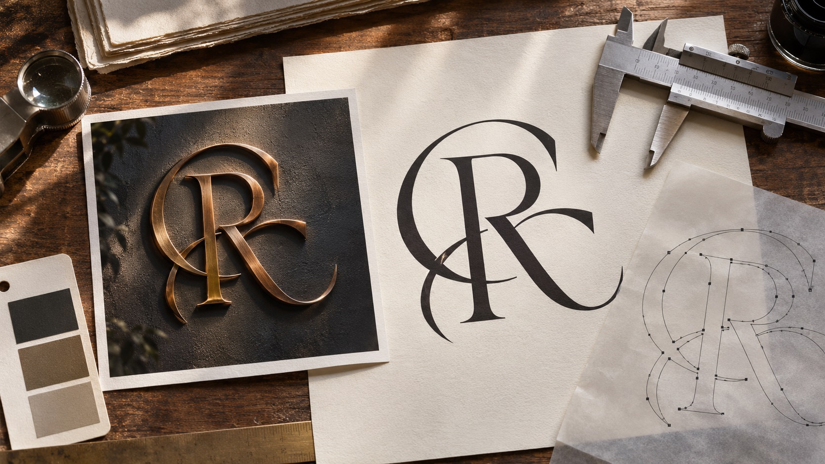
A 3D logo mockup can make a brand look expensive. Metallic letters sit on a marble wall. A glossy emblem casts realistic shadows. The gold finish looks impressive in a social media post.
Then you send the image to a printer and hear: "We need the flat vector logo, not the mockup."
This is a common situation for businesses that received an AI-generated logo image, a rendered branding presentation, or a photograph of a dimensional sign without the original artwork.
A three-dimensional appearance and a usable vector logo are different deliverables. To prepare the design for real production, you usually need to recover or reconstruct the intentional flat shapes underneath the lighting, perspective, and material effects.
Here is how that process works, what can be preserved, and what a clean final file should contain.
Why a 3D logo mockup is not automatically a vector logo
A logo mockup is often a picture of how a design might look on a physical surface. It can contain reflections, perspective, depth, soft highlights, texture, and shadows.
Even if it looks like a physical metal sign, the file may simply be a JPG or PNG. Each visible effect has been baked into pixels.
A flat vector logo is different. It defines letterforms and graphic shapes using paths, fills, and other editable information.
That distinction matters when your next supplier needs to:
- Cut lettering from vinyl.
- Print the logo on a transparent background.
- Prepare the source artwork for embroidery digitizing.
- Make a stencil or simple single-color version.
- Resize a logo for a large sign without blurry edges.
- Change the brand colors without repainting a picture.
An attractive render can be a useful reference. It is not proof that editable logo geometry exists.
First determine what kind of 3D file you actually have
Before ordering a redraw, look at the source files.
A flat PNG or JPG that looks three-dimensional
This is the most common problem. The depth is an illusion made from shading, highlights, and perspective in a two-dimensional raster image.
The flat artwork usually needs to be reconstructed.
An editable vector logo with 3D effects applied
A designer may have started with genuine Illustrator vector objects and applied extrusion, bevel, materials, and lighting.
If the native source file still contains those original objects, you may be able to recover a flat version much more easily.
Ask for the original AI file or another editable master before paying for recreation.
A real three-dimensional model
Files such as GLB, OBJ, and STL describe three-dimensional geometry in various ways. A model is useful for certain 3D workflows, but it is not the same as a clean 2D brand identity file.
You might be able to derive a front-facing silhouette, although the result may still need manual adjustment.
The first question is not "Can this picture be converted?" It is "Does an editable flat logo already exist somewhere?"
Why simply tracing the rendered image often fails
Automatic tracing can turn raster boundaries into vector shapes. Adobe Illustrator's Image Trace supports a range of presets and editable path outputs.
But the result follows what the raster image contains.
For a metallic 3D logo, those pixels can include a bright front face, dark sidewalls, reflective streaks, a beveled edge, and a shadow on the wall.
A trace may interpret each area as another colored shape.
Instead of one clear letter, the file can contain dozens of overlapping paths. The output may scale without pixelation, yet still be difficult to edit, print as one color, or send to a vinyl cutter.
Adobe's guidance on Image Trace also points out that gradients and complex images can produce many discrete shapes, and source quality significantly affects the result.
The correct fix is often to redraw the underlying contours rather than preserve every lighting effect.
What does "flatten the 3D logo" actually mean?
For logo reconstruction, flattening should mean creating a front-facing version of the mark with intentional two-dimensional geometry.
It does not necessarily mean clicking a software command called Flatten Transparency.
There are at least three different outcomes you could request:
Flat brand logo: Clean wordmark and icon, without depth or surface lighting.
Flat illustration of a 3D design: A two-dimensional drawing that deliberately retains some bevel shapes and shadows.
Vectorized rendering: Many paths approximating the image's visible colors and highlights.
The first option is usually the most useful long-term brand master. The second may be useful as an additional decorative logo. The third is often much harder to reuse.
Tell the artist which result you actually want.
Step 1: Find the real front face of the logo
Imagine a 3D letter R tilted away from the camera.
The visible picture includes its front, the right side, and perhaps a top bevel.
For a flat logo, you typically need the underlying front-face outline, not the combined outside silhouette of all three surfaces.
A designer studies the visible contours to identify that front face.
Where the perspective or lighting hides part of a curve, the designer must infer its intended shape from the rest of the design. This is reconstruction, not exact recovery.
A straightforward circle or geometric shield may be easier to rebuild than a heavily distorted custom script.
Step 2: Correct the perspective
A logo shown at an angle may appear wider on one side and narrower on the other.
If you trace the visible image without correcting that perspective, the flat logo may inherit distorted proportions.
A front-on screenshot, an alternate mockup angle, or a flat reference can help.
If the only reference is a dramatic perspective view, some dimensions will be uncertain. The client should approve the reconstructed proportions rather than expecting the artist to discover a hidden mathematically exact original.
For important brand marks, ask for a clean front-view proof before any decorative effects are recreated.
Step 3: Rebuild the icon as clean paths
Icons usually need simpler shapes than a rendered image suggests.
A glossy circular emblem might contain many highlights, but its real design could be just a circle, two arcs, and a small central symbol.
The vector artist should identify the intended shapes, maintain symmetry where appropriate, and redraw smooth curves with sensible anchor points.
Good source geometry makes later editing easier.
Unnecessary points, rough outlines, and tiny isolated objects can create problems in fabrication.
For a simple flat logo, the production file should not need dozens of extra shapes simply to imitate reflected light.
Step 4: Reconstruct the lettering deliberately
Text is often the hardest part, especially when the render came from an AI image generator.
A 3D mockup may contain letters that look like a familiar font but are subtly inconsistent.
Check the exact business name, spelling, capitalization, punctuation, and tagline before tracing.
If the wording resembles a known typeface, a designer may select a properly licensed close match and adjust spacing or letter details.
If it uses custom lettering, a manual redraw may be more appropriate.
Remember that the original font may never have existed as an actual font file. A generated image can produce typography-like pixels without creating editable type.
The correct final letters need to be approved by the business owner.
Step 5: Remove lighting without destroying the brand
This is where the job can become confusing.
A client may say, "Keep the same 3D look but make it flat."
That could mean different things:
- Preserve the overall shape and color, but remove all dimensional effects.
- Keep an approved metallic gradient as a separate decorative version.
- Preserve a specific inset or outline that is genuinely part of the logo.
- Remove the mockup wall and shadows, but retain the graphic's intended highlights.
A useful deliverable set might include a clean flat master and a decorative version with selected effects.
It is not always necessary to choose only one.
The flat master can serve production vendors that need solid shapes. The decorative version can be used for web banners or social graphics.
Step 6: Rebuild the colors, not the reflections
A chrome or gold material can appear almost white in one area and nearly black in another.
Those highlights are influenced by the rendered environment. They are not necessarily the brand's intended color palette.
For a clean vector master, ask the client to approve the flat colors separately.
A metallic-looking gradient may still be appropriate for certain digital artwork, but a gold appearance on a screen does not automatically translate into metallic ink, foil, or an actual metal material.
For print production, the supplier may need specific ink, foil, or material information.
Keep the logo's geometry separate from the physical finish.
What if the original concept is a photographic 3D emblem?
Some generated artwork has intricate glass, smoke, chrome, stone, or sculpted elements rather than clean logo-style shapes.
That may be closer to an illustration or a scene than a conventional flat logo.
It can still inspire a vector icon, but not every photographic detail can be preserved while achieving a simple production-ready master.
A responsible redraw service should explain which design elements are recoverable and which require interpretation or simplification.
If the finished result needs to match a specific visual identity exactly, ask for a review proof before final delivery.
How to check whether the output is a real vector logo
The file extension alone is not enough.
An SVG can contain an embedded PNG. A PDF may be nothing more than a picture placed on a page.
Open the final file in suitable vector editing software and inspect the artwork in outline or wireframe view.
Check that:
- The letters and icon are genuinely defined by clean paths.
- Curves are smooth at high magnification.
- Important counters and holes remain open.
- The file does not contain a hidden photograph of the original mockup.
- You can change a logo color without editing a whole bitmap.
- The proportions are consistent with the approved proof.
- A one-color version remains recognizable.
A good logo master should remain practical when used by someone who did not create it.
Does Adobe Illustrator have a one-click solution?
Illustrator includes Image Trace and newer vector-generation workflows. These can be useful starting points, particularly for simple shapes and high-quality source images.
But there is no one setting that guarantees exact recovery of a 3D rendered logo.
Adobe's own Image Trace best-practices guidance distinguishes straightforward art from complicated photographs, gradients, and lettering. For exact logo work, human review still matters.
When tracing creates rough or excessive paths, cleanup or reconstruction may be faster than repeatedly adjusting automated settings.
For a business that needs production-ready deliverables rather than a one-off effect, judge the quality of the actual path geometry.
Which files should the finished package include?
For most small businesses, a useful package is:
- An editable vector master where agreed.
- A clean SVG for supported digital and design workflows.
- A vector PDF for suppliers that accept it.
- AI or EPS files when specifically needed.
- Transparent PNG exports at suitable practical sizes.
- A full-color flat logo.
- A dark or black one-color version.
- A white one-color version for dark surfaces.
- An optional decorative version preserving the approved 3D appearance.
Not every order includes every format. Confirm deliverables before paying.
Keep the actual flat master separate from rendered mockups so another supplier knows which file to use.
Example: a metallic wall-logo image for a new restaurant
Imagine a restaurant whose only logo is an AI-generated image of bronze letters mounted on black marble.
The owner loves the lettering and the small leaf symbol.
A practical reconstruction job might follow this order:
- Confirm the exact restaurant name and wording.
- Request any original prompts, source images, or alternate views.
- Identify the front-face shapes of the letters and leaf.
- Correct perspective distortion.
- Rebuild custom letterforms or approve a licensed typeface match.
- Draw clean, consistent leaf paths.
- Define the approved flat bronze-inspired color.
- Export a black single-color version for vinyl and signage.
- Keep the metallic mockup as a reference, not the production master.
- Ask the owner to approve the reconstructed artwork before delivery.
The final files give the restaurant far more flexibility than the initial image, even if the dramatic render stays part of the marketing materials.
Common mistakes when turning 3D mockups into vector logos
Tracing the shadow as part of the logo
A wall shadow is usually not a permanent part of the brand geometry.
Keeping the perspective distortion
The angled mockup may look exciting, but the flat wordmark needs consistent proportions.
Assuming a metallic gradient equals a metallic print finish
Physical foils, inks, and materials need separate supplier instructions.
Delivering an SVG containing a raster image
That is an SVG container, not a clean vector redraw.
Changing the lettering without approval
An artist may need to interpret the original. The correct brand spelling and character design should be reviewed.
Forgetting to create one-color versions
A logo that works only with chrome effects may be hard to apply to embroidery, single-color stamps, or cut vinyl.
Frequently asked questions
Can a 3D logo PNG be converted into a flat SVG?
Often, yes, by reconstructing its underlying 2D shapes. Automatic tracing may help with simple artwork, but heavily rendered images can require manual redraw and customer approval.
Can you remove a 3D effect without changing the logo?
If the original editable vector source still exists, sometimes the effects can be adjusted or removed. From a flattened image alone, some parts must be inferred.
Will vectorization keep the exact gold or chrome appearance?
A decorative vector version may approximate some effects, but a clean flat logo normally separates brand shapes from lighting and reflections.
Is a 3D logo mockup suitable for a sign shop?
It is useful as a visual reference. Most fabrication jobs also need clean source geometry and the sign company's production specifications.
Can I make a single-color logo from an AI-generated 3D image?
Usually, if the intended silhouette and lettering can be identified. Fine details may need an approved simplified version.
Will the recreated file be the original logo?
It is a reconstruction, not necessarily the exact lost source file. Ask for a proof to confirm shape, text, and color choices.
Turn the impressive mockup into a logo suppliers can use
A 3D logo presentation can show how a brand might look in the real world. A flat vector master is what allows the same identity to move reliably between printers, sign makers, clothing suppliers, and designers.
If all you have is a metallic, glass, or wall-mounted 3D logo image, contact VectorFixer and include the source image, exact business name, and intended production uses. A careful vector reconstruction can preserve the recognizable design while giving you practical reusable artwork.
Further reading
- Adobe: Image Trace best practices and limitations
- Adobe: Raster versus vector image formats
- Adobe: Create 3D vector artwork
Need artwork converted?
VectorFixer can redraw logos, convert PNG files to SVG, and prepare clean production-ready vector files.
Contact Us