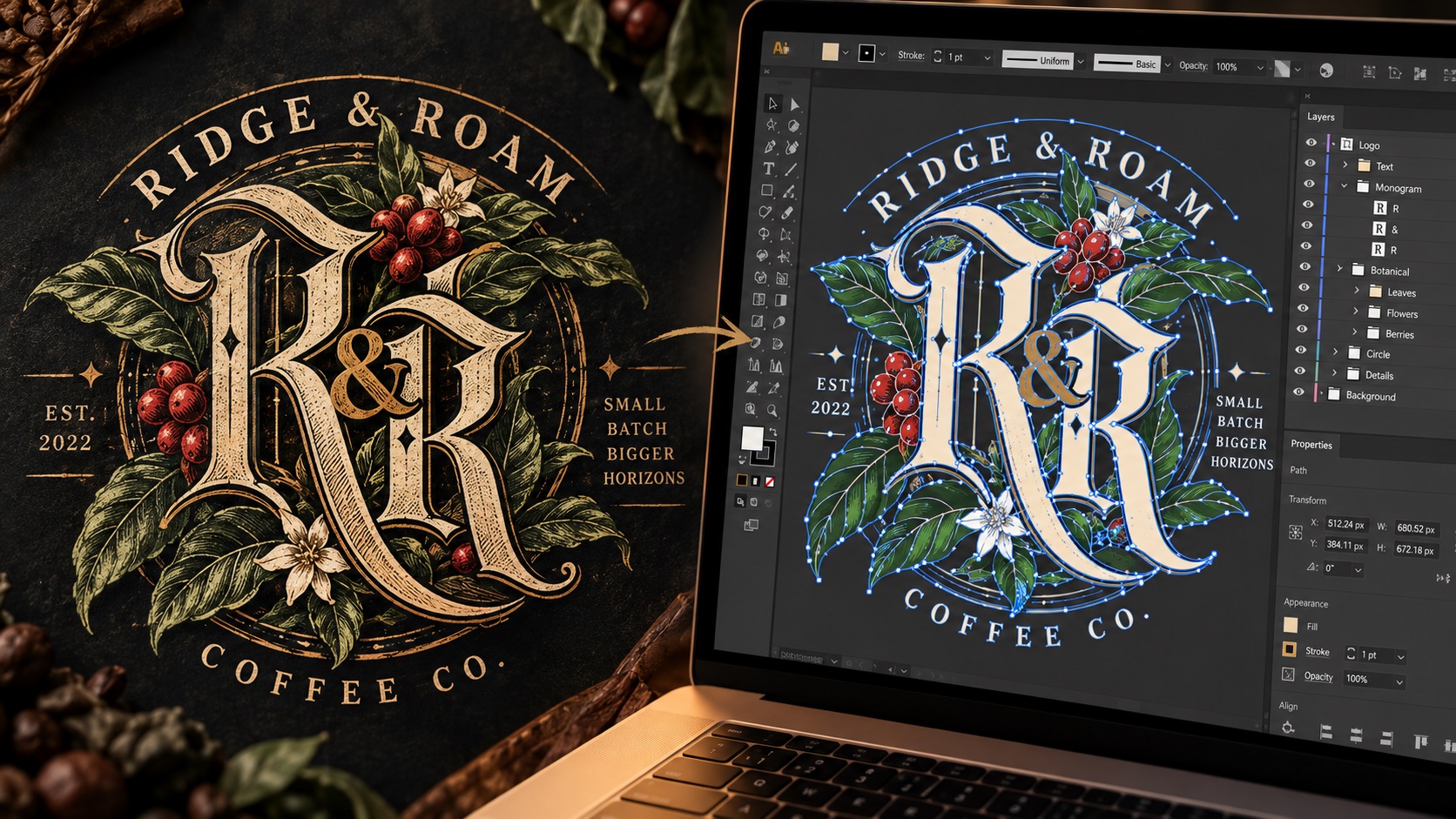
Crafted linework logos are one of the most technically demanding styles a vectorizer encounters. The name says it all: these logos are built from lines, and the quality of those lines is everything. Thin strokes, intricate crosshatching, fine engraving-style detail, delicate botanical illustration, and hand-drawn precision all fall under this category.
In 2026, crafted linework is enjoying a strong resurgence alongside the Storybook Gothic aesthetic, which combines dark, ornate gothic letterforms with intricate illustrative detail. Both styles share a common challenge: they look extraordinary when executed well, but they are among the most unforgiving logo styles to vectorize and produce.
Here is what makes these logos different and how to approach them correctly.
What Defines Crafted Linework and Gothic Logos
Crafted linework logos are characterised by:
- Fine, consistent stroke weights that carry the visual information of the design
- Intricate detail: crosshatching, stippling, botanical elements, decorative borders, and ornamental flourishes
- High information density: more detail per square centimetre than almost any other logo style
- A handcrafted or artisanal quality suggesting the design was drawn rather than assembled
- Often monochromatic or limited color, since the linework itself carries the visual weight
Storybook Gothic logos add:
- Gothic or blackletter typefaces with their characteristic angular, high-contrast strokes
- Dark, mysterious illustrative elements: ravens, moons, skulls, botanicals, architectural details
- A sense of history and craftsmanship that references medieval manuscripts, Victorian engravings, and folk illustration
Why These Logos Are Hard to Vectorize
Volume of Paths
A crafted linework logo can contain hundreds or thousands of individual lines. Each stroke, each crosshatch line, each fine botanical element is a separate path or part of a complex grouped shape. The sheer volume of path construction required for a detailed linework illustration far exceeds that of a simple geometric or wordmark logo.
This means vectorization of complex linework logos takes significantly more time than standard logo work, and the result reflects that investment.
Minimum Line Weight
The defining characteristic of linework logos is their fine strokes. But fine strokes have minimum thickness requirements in many production contexts. A line that is 0.2mm wide at the final logo size may be technically present in the vector but invisible or broken when screen printed, embroidered, or laser engraved.
For linework logos intended for production, the minimum line weight for the intended production method needs to be confirmed and the design adjusted accordingly. This is a design decision as much as a technical one, and it sometimes requires simplifying the linework for specific production contexts.
Auto-Tracing Fails Completely
For any logo, auto-tracing is a compromise. For crafted linework logos, it is essentially useless. The fine lines in a linework logo, particularly in scanned or photographed drawings, have soft edges, slight variation in width, and tonal variation from the drawing medium. An auto-tracer produces jagged, irregular paths that bear a superficial resemblance to the original but lack the precision and quality that makes the style work.
Linework logos require manual path construction by someone who understands how to draw clean bezier strokes with consistent weights and smooth curves.
Gothic Letterforms
Blackletter and gothic typefaces have extremely high contrast between thick and thin strokes, angular connections between strokes, and specific historical conventions around how letters are formed. Tracing gothic letterforms without understanding their construction often produces paths that are almost right but subtly wrong in ways that are immediately noticeable to anyone familiar with the style.
For gothic wordmarks, identifying the typeface and recreating from the actual font (converted to outlines) is the most accurate approach where the font is a commercial typeface. For custom-drawn blackletter that deviates from standard conventions, careful manual tracing with attention to the calligraphic logic of the strokes produces the best result.
Production Realities for Linework Logos
What Works
Large-format printing is where crafted linework logos shine. At large scale, all the fine detail is visible and the quality of the linework becomes a genuine asset. A detailed linework logo on a large printed banner or building wrap looks extraordinary.
High-quality offset printing for business cards, stationery, and packaging reproduces fine linework well, particularly on uncoated paper stocks that suit the artisanal aesthetic.
Laser engraving on wood, leather, and some metals can reproduce fine linework beautifully, particularly where the engraved marks read as fine lines. This is one of the production methods that genuinely complements the crafted aesthetic.
Letterpress printing produces a result that perfectly suits the aesthetic of crafted linework logos. The impression of type and illustration into thick paper creates a tactile quality that references the historical tradition these logos draw from.
What Requires Adaptation
Screen printing can handle linework logos but has a minimum line width requirement determined by the screen mesh. Very fine lines may need to be thickened for the specific printing context. Single-color screen printing often works beautifully with linework logos where the detail reads as a single ink impression.
Embroidery requires significant simplification of linework logos. The fine detail that defines the style cannot be reproduced in thread at typical embroidered logo sizes. A simplified, bolder version is usually needed for embroidery applications.
Small-scale applications like favicons, app icons, and small merchandise require a simplified icon version. The full linework detail is unreadable at small sizes.
What to Provide for the Best Vectorization Result
For crafted linework logos, the source material makes a significant difference:
The original artwork file if available. If the design was created in Illustrator or another vector program, it may already be a vector that needs cleaning rather than a full retrace.
A high-resolution scan if hand-drawn. For hand-drawn linework, scanning at 600 DPI or higher gives the tracer the most information to work from. Scanning in high contrast black and white (not greyscale) often produces the cleanest input.
Clear notes on which details are essential. In a complex linework logo, not everything has equal visual weight. Knowing which elements are central to the design helps the tracer prioritise accuracy where it matters most.
The intended production contexts. Knowing upfront that the logo needs both a large-format print version and an embroidered cap version means both can be discussed and planned from the start.
Frequently Asked Questions
Our linework logo was drawn by a professional illustrator. Does it still need vectorization?
If the illustrator worked in a vector program and delivered vector files, it may already be vector. If the illustrator delivered a raster image, even a beautiful high-resolution one, it needs to be vectorized before it will work for professional production.
Can fine crosshatching in our logo be reproduced in screen printing?
Depends on the line weight and the mesh count of the screen. Very fine crosshatching may require a high mesh count screen and may still show slight limitations at small sizes. Discussing the specific line weights with your screen printer before production is worth doing.
Our gothic wordmark uses a commercial blackletter font. Does that simplify vectorization?
Significantly. If the font is identifiable, the letterforms can be set in the actual typeface and converted to outlines rather than being traced from a raster source. This produces more accurate letterforms with correct stroke weights and proportions.
Need artwork converted?
VectorFixer can redraw logos, convert PNG files to SVG, and prepare clean production-ready vector files.
Contact Us