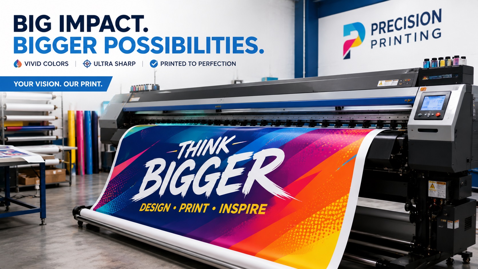
There is a big difference between printing a flyer and printing a banner. Most people figure this out the hard way. Something that looks fine as a small digital file can fall apart completely once it gets printed at 6 feet wide. The bigger the print, the less room there is to hide weak files.
This guide covers what large format printing actually demands from your files and how to make sure your artwork holds up at scale.
What Counts as Large Format Printing?
Large format printing typically refers to any print job wider than about 18 inches. This includes:
- Pull-up banners and retractable displays
- Outdoor and indoor banners
- Posters and foam board displays
- Window graphics and frosted film
- Building wraps and hoardings
- Trade show displays and backdrops
- Vinyl signage and wayfinding graphics
- Vehicle wraps
The common thread is that these prints are viewed from a distance. A banner hanging behind a trade show booth is typically viewed from at least a few feet away. A billboard is viewed from much further. This changes what resolution is actually needed.
Resolution Rules Are Different at Large Sizes
For desktop printing, the standard is 300 DPI at the print size. At that number, photos and graphics look crisp at close range.
Large format printing works differently. Because these prints are viewed from further away, the resolution requirements go down. Most large format print shops work comfortably at 100 to 150 DPI at the actual print dimensions. For items viewed from very far away, such as building wraps or large outdoor signage, even 72 DPI at full size can produce a perfectly acceptable result.
This is worth knowing because it affects how you think about your files. A photo that is 6000 pixels wide and 4000 pixels tall can print very well at banner size, even though it would be considered low resolution if you were printing it at poster size on a desktop printer.
The mistake people make is the opposite: sending a file that looks high resolution in the settings but is actually too small in pixel dimensions. A photo that is only 600 pixels wide saved at 300 DPI is not a high-resolution file for large format use. It is a small file with a misleading label.
Logos and Text Are a Different Story
Photographs in large format prints can often get away with lower effective resolution because the human eye blends continuous-tone images naturally at a distance. Logos, text, and graphics with hard edges are much less forgiving.
A photo of a product on a banner might look fine even if the file is not perfect. Your company logo on that same banner will show every quality problem the moment it is scaled up. Fuzzy edges, pixelated corners, and blurry text stand out immediately.
For this reason, logos and any graphic with clean edges or text must be in vector format for large format printing. Not a high-resolution PNG. Not a TIFF. A vector file: AI, EPS, SVG, or a vector-based PDF.
Vector files have no pixels. They describe shapes using mathematical paths, so there is no upper size limit where they start to look blurry. Your logo looks the same at two inches as it does at twenty feet.
Color Mode Matters Too
Screens display colors using RGB, a system that creates colors by mixing red, green, and blue light. Large format printers use CMYK, which mixes cyan, magenta, yellow, and black inks.
Colors can shift when you move from RGB to CMYK. Vibrant blues and bright purples are particularly prone to this. A deep electric blue that looks striking on screen might come out looking more muted once printed.
For artwork going to large format print, building your files in CMYK from the start reduces the chance of color surprises. If you already have your artwork in RGB and cannot change it, ask your print shop for a proof before committing to a full print run.
Logo colors are especially important here. If your brand colors shift between what you see on screen and what appears on a printed banner, it can look inconsistent next to your other branded materials. Using Pantone color references for your logo helps your printer match them accurately regardless of mode.
Bleed and Safe Zones
Most large format print shops require a bleed area around the edges of your artwork. A bleed is an extra strip of color or background that extends beyond the trim line. When the print is cut to its final size, the bleed ensures there is no white edge visible if the cut is slightly off.
A standard bleed for large format printing is around 0.25 to 0.5 inches on each side, though your print shop may specify different requirements.
The other side of this is the safe zone. Important content like your logo, contact details, and key messages should be kept away from the edges of the design, inside what is called the safe area. Anything too close to the edge risks getting cut off.
Always ask your print shop for a template before you start building your artwork.
File Formats for Large Format Printing
Different print shops have different preferences, but the most widely accepted formats are:
- PDF (vector-based, not image-based)
- AI (Adobe Illustrator native file)
- EPS
- TIFF (for photo-heavy designs where all logos are already embedded as vectors)
JPEG is sometimes accepted for photo files but is not ideal because of compression artifacts. PNG is rarely used in professional large format workflows.
If your design mixes photos and logos, the best approach is usually to build the full layout in Illustrator or InDesign, place your photos as embedded links, and keep all logos in native vector format within the same document.
Frequently Asked Questions
Does my entire banner file need to be a vector?
Not necessarily. Photos and background images can be raster, as long as the resolution is sufficient for the print size. Logos, text, and any graphic with sharp edges should be vector.
What DPI should I use for a large banner?
Aim for 100 to 150 DPI at the actual print size. For very large items viewed from a long distance, 72 DPI at full print size is often sufficient. Check with your specific print shop for their requirements.
My logo is a PNG. Can I just use a really big version of it?
If the PNG is large enough in pixel dimensions and the logo is simple with clean edges, sometimes this can work for smaller banners. For anything very large, or for logos with text or fine detail, a proper vector file will always produce a sharper result.
Why do my logo colors look different on the banner than on my screen?
This is a CMYK vs RGB color difference. Screens use RGB light to create colors. Printers mix CMYK inks. Some colors, especially bright blues and purples, shift when converted. Building your files in CMYK helps, as does using Pantone color references for your brand colors.
My print shop gave me a size in feet. How do I set that up in Illustrator?
You can set your Illustrator document to use feet or inches as the measurement unit. Many designers work at a reduced scale, such as 1 inch equals 1 foot, to keep the file manageable. Always confirm the final output size with your print shop before you start.
Need artwork converted?
VectorFixer can redraw logos, convert PNG files to SVG, and prepare clean production-ready vector files.
Contact Us