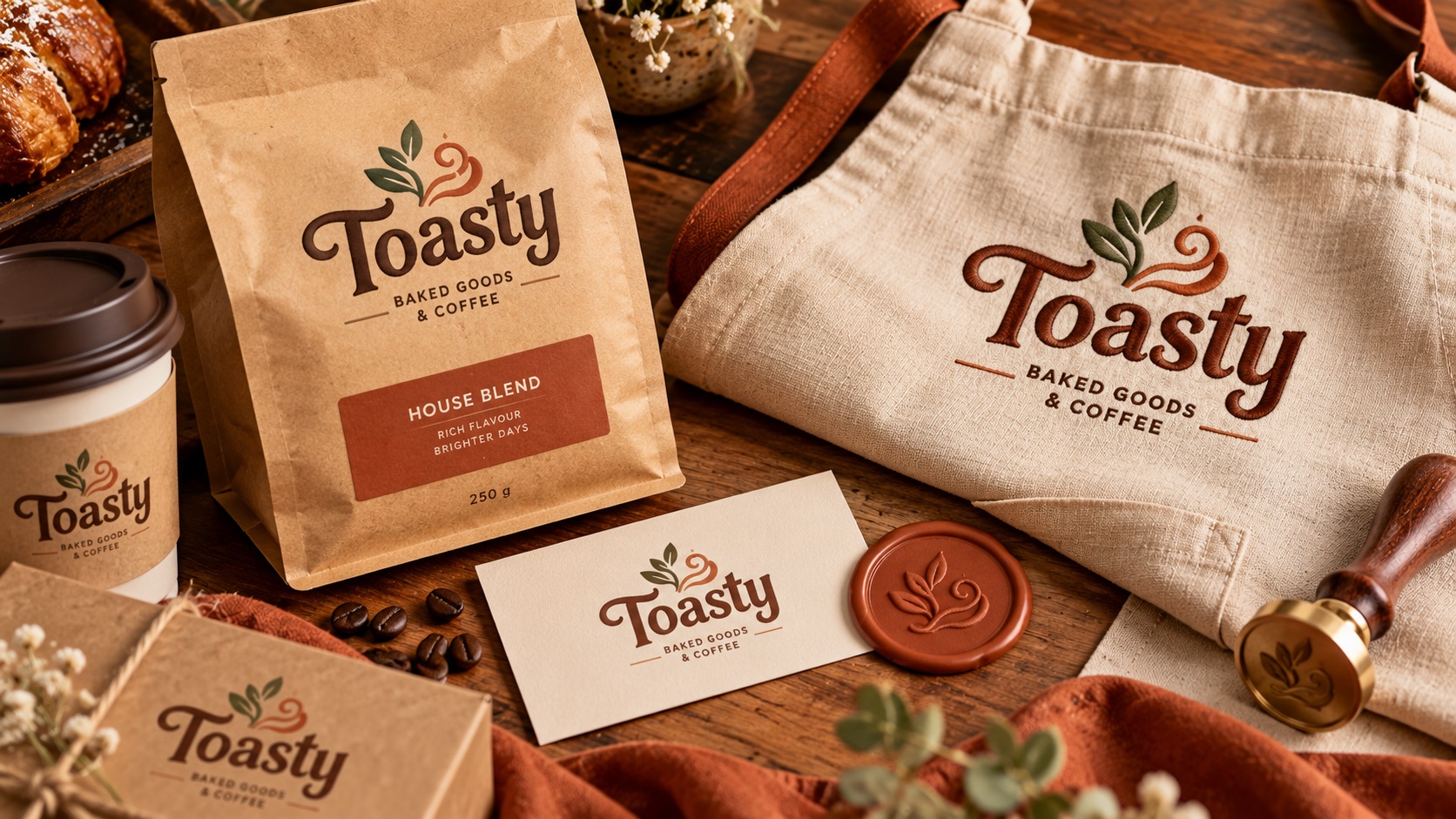
Toasty Logos are one of the warmest and most commercially appealing logo trends of 2026. The name captures the aesthetic perfectly: rounded letterforms, soft curves, earthy palettes of oat, cream, terracotta, clay pink, sage, and faded navy, hand-drawn scripts, organic badge shapes, and light textures like paper grain or pencil speckle.
This style is showing up everywhere in food, hospitality, wellness, sustainable fashion, craft brands, and any business that wants to signal warmth, approachability, and genuine human craft. It is the visual equivalent of a small cosy cafe rather than a corporate chain.
For businesses embracing this direction, the aesthetic is appealing and the design intent is clear. What is less clear, until you try to get something printed, is how specific the production requirements are for a logo style built on warmth, texture, and soft organic forms.
What Defines the Toasty Logo Style
A Toasty Logo typically combines several of these elements:
Rounded typefaces: Fonts like Cooper, Söhne Rounded, and Quicksand with their soft terminals and generous curves. Nothing angular or sharp.
Warm earthy palettes: Colors that feel like natural materials. Oat and cream for backgrounds, terracotta and clay pink as accent tones, sage and faded navy for depth. No cool greys, no electric colors.
Organic badge shapes: Rounded rectangles, softly irregular ovals, hand-drawn circles. Shapes that feel like they were drawn with a marker rather than plotted by a computer.
Hand-drawn script elements: Handwriting-style lettering, casual brush strokes, and script accents that add personal warmth.
Light textures: Paper grain, pencil speckle, subtle noise that suggests the logo was printed on natural materials rather than displayed on a screen.
Simple character doodles: Small illustrative elements: a coffee cup, a leaf, a bread loaf, a sprig of herbs. These should be simple enough to read at small sizes.
The Vectorization Approach for Toasty Logos
Toasty logos share some challenges with other texture-based styles covered earlier in this series, but they have their own specific considerations.
Rounded Fonts Are Friendlier to Trace
One advantage Toasty logos have over gothic or linework styles is that rounded, warm typefaces are much cleaner to vectorize than high-contrast blackletter. The generous curves and consistent stroke weights of fonts like Cooper and Quicksand trace more naturally and forgive minor imperfections better than thin serif or gothic styles.
For Toasty wordmarks using identifiable commercial fonts, recreating the letterforms from the actual typeface (converted to outlines) is the most accurate and efficient approach.
Organic Shapes Need Human Judgment
The intentionally imperfect organic shapes in Toasty logos require the same design judgment as other hand-crafted styles. A shape that is supposed to look like a slightly irregular hand-drawn oval needs to actually look intentionally irregular, not like a poorly traced perfect oval. The imperfection needs to be deliberate.
Auto-tracing an organic badge shape from a PNG produces a result that looks accidentally imperfect rather than intentionally so. The difference is immediately noticeable. Manual construction of each organic shape preserves the intended character.
Small Character Illustrations
The simple doodle elements in Toasty logos (the little coffee cup, the leaf, the bread) are typically straightforward to vectorize because they are designed to be simple. The main thing to watch is that any enclosed areas in the illustration are correctly handled as compound paths.
The Texture Layer Question
Like all texture-forward logo styles in 2026, Toasty logos have a paper grain or pencil speckle texture that contributes to the warmth of the aesthetic. This texture cannot be embroidered, screen printed, or laser engraved. It exists as a visual treatment for digital and large-format print use.
A complete file set for a Toasty logo includes a clean vector version (for production use) and a textured output version (for packaging, digital, and contexts where the full aesthetic can be shown).
Production Methods That Suit Toasty Logos
The Toasty aesthetic actually has strong natural fits with several production methods:
Uncoated paper stocks: Business cards, stationery, and packaging on uncoated or recycled papers. The slightly absorbent surface of uncoated stock allows ink to settle in a way that naturally reinforces the warm, handcrafted quality of the logo.
Kraft paper packaging: The earthy palette of Toasty logos is a natural match for kraft paper bags, boxes, and wrapping. The warm brown of the paper and the oat and terracotta tones of the logo create a cohesive material quality.
Letterpress and risograph printing: These analog print methods produce results with their own inherent texture and warmth that complement the Toasty aesthetic better than digital printing in many cases.
Wax seals: For packaging that uses a wax seal with the brand mark, the organic imperfection of the wax impression is a perfect physical expression of the Toasty aesthetic.
Screen printing on natural fabrics: Cotton and linen garments with ink that absorbs into the fabric rather than sitting on top of it. The softened edges of screen-printed ink on natural fabric suit the warmth of the design.
Embroidery on linen and canvas aprons: For food and hospitality brands, embroidered logos on natural fabric aprons and tote bags reinforce the artisanal quality. The simplified clean vector works well for embroidery at appropriate sizes.
What to Watch Out For
Very small character doodles at small application sizes. The little illustrative elements work beautifully at label size but can disappear on a small embroidered cap or a tiny sticker. Have a simplified version without the doodles for small-format applications.
Script elements at small sizes. Hand-drawn script accents that are charming on a label can become illegible on a small badge or at distance. A version without the script accent is worth having for constrained applications.
Color accuracy across warm palettes. Earthy warm colors like terracotta and clay pink can shift between screen display and CMYK print. Defining colors with Pantone references and testing on actual materials is particularly important for palette-driven brands like Toasty.
Frequently Asked Questions
My Toasty logo was made in Canva using one of their rounded fonts. Can it be vectorized?
Yes. A vectorization service can take the Canva output, identify the font used, and recreate the letterforms as clean outlined vector paths. If the font is a standard commercial font available in the service's library, the result will be very accurate.
The paper grain texture is important to our brand. Will we lose it in vectorization?
The clean base vector will not have the texture. The texture is re-applied for print and digital contexts where it can be shown. You get both a clean production-ready version and a textured output version.
Our brand uses a specific earthy color that keeps printing slightly wrong. What do we do?
Define the color with a Pantone reference and share it with every print vendor. Earthy warm tones are exactly the colors most likely to shift between RGB screen display and CMYK print output. A Pantone match removes this variable.
Need artwork converted?
VectorFixer can redraw logos, convert PNG files to SVG, and prepare clean production-ready vector files.
Contact Us