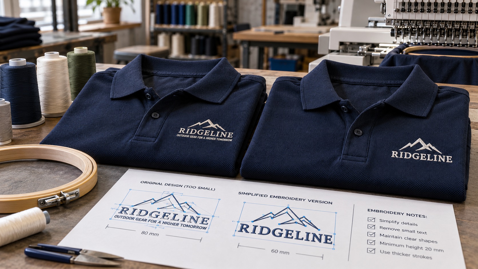
A business owner orders embroidered polo shirts for a team. The company logo looks sharp on the proof, but the small slogan underneath comes back as a row of cramped stitches.
The main logo might be fine. The problem is often the smallest text.
A left-chest embroidery design is a physical object made from thread. It does not behave like the same logo displayed on a screen or printed on a brochure.
If you are ordering polos, uniforms, workwear, or branded staff shirts, the easiest time to fix tiny text is before digitizing and production start.
Why does small embroidery text become unreadable?
Thread has thickness. Fabric has texture. The needle needs room to form recognizable letters, and every stitch pulls on the material slightly.
On screen, a tiny lowercase e has a clean open center. On a piqué polo, stitches can narrow or close that space.
Condensed fonts, thin serifs, tight letter spacing, and detailed script are harder to read as the finished size gets smaller.
The problem becomes more obvious when the logo is reduced from the full-size brand artwork to a small left-chest position.
Good digitizing can help, but it cannot make an unlimited amount of detail fit into a tiny space.
How large is a normal left-chest logo?
A practical adult left-chest logo is often around 3 to 4 inches wide, though the right size depends on the garment, wearer, logo shape, and supplier.
Some designs are narrow and tall. Others are horizontal wordmarks that need more width.
The correct measurement is the finished embroidered size, not the width of the image on your computer.
Ask your supplier to confirm the intended width and height before preparing the artwork.
A design might look simple at 5 inches wide and become impossible to read at 3 inches wide. The difference is often the height of the smallest letters.
What is the minimum size for embroidered text?
There is no universal minimum that works on every fabric or embroidery machine.
As a practical starting point, many embroidery suppliers prefer small capital letters to be roughly 5 to 6 mm tall or larger for reliable readability in ordinary garment embroidery. Some shops can successfully stitch smaller lettering with particular fonts, threads, and materials.
Lowercase lettering needs special attention because the short letters are smaller than capitals. Very narrow letters, serif fonts, and pile fabrics can also need additional room.
Treat the numbers as planning guidelines, not guaranteed production specifications.
Your embroidery shop should review the actual design and fabric before approving a size.
The tagline is often the first thing to remove
A company logo might include a large brand name and a smaller slogan such as "Reliable Service Since 2004."
That tagline may look balanced on a website. On a left-chest logo, it might need to be only a few millimeters tall.
Trying to keep every letter can create an unreadable strip of stitches beneath the main wordmark.
Common solutions include:
- Remove the tagline from the polo version.
- Move the tagline to a larger back print.
- Increase the overall embroidery size where the garment allows.
- Replace the tiny tagline with a simpler short phrase.
- Create a separate icon-and-wordmark version.
The business can keep the full slogan on its website, signage, stationery, and social media graphics.
A production-specific version is not a new brand. It is the same identity adapted for the space.
Why font style matters so much
Two fonts set at the same nominal size can stitch very differently.
A bold, open sans-serif is often easier to embroider at small sizes than a delicate serif, highly condensed font, or thin calligraphic script.
Look for:
- Open spaces inside letters such as a, e, o, and p.
- Distinct shapes between similar letters.
- Comfortable gaps between characters.
- Strokes thick enough to form in thread.
- Few unnecessary decorative flourishes.
If changing the brand font is not acceptable, ask whether the logo can be made larger or whether the small text can be omitted.
Do not substitute a different typeface without getting brand approval.
Piqué polos create their own challenges
Many polo shirts use piqué knit, a fabric with a visible textured surface.
That texture can make very fine stitches appear uneven or disappear into the fabric.
Different garment materials behave differently. A smooth, tightly woven work shirt may show tiny details more clearly than a stretchy polo or fluffy fleece.
The embroiderer adjusts the stitch setup and underlay for the fabric, but the source artwork still needs reasonable proportions.
Tell the vendor exactly what garment you are buying. "A shirt" is not enough information for reliable digitizing.
Why a sharp vector logo can still stitch badly
A vector logo is a good starting point. It has editable curves and shapes that can be scaled without turning pixelated.
But clean vector artwork does not automatically equal a usable embroidery design.
For example, a vector wordmark can still contain:
- Lettering that becomes too small.
- Very narrow spaces inside letters.
- Hairline borders.
- Multiple touching shapes.
- Tiny dots or accent marks.
- Gradients or soft effects that do not translate directly into thread.
A digitizer may need to simplify those features.
That is why a clean vector master and a simplified embroidery version can both be useful.
VectorFixer's embroidery artwork preparation service focuses on cleaning and simplifying the source artwork before a separate digitizer creates the machine stitch file.
Is the vector file the same as a DST or PES file?
No.
An SVG, AI, EPS, or vector PDF describes graphic shapes and paths.
A DST, PES, or other embroidery machine file describes stitches. It controls where the needle moves, when the thread changes, and how the design is sewn.
The digitizer decides details such as stitch direction, density, underlay, compensation, and sequence based on the artwork and garment.
Simply saving an SVG with a different extension does not produce a real stitch file.
You may need both: a reusable clean vector logo for your brand files and a properly digitized stitch file for the specific embroidery job.
How to prepare small lettering before digitizing
1. Set the final physical size
If the logo will be stitched 3.25 inches wide, evaluate it at that width.
Do not judge readability from an enlarged view on your monitor.
2. Inspect the smallest word
Measure and examine the slogan, website, or small location name under the main logo.
If the smaller letters merge when viewed at actual size, the embroidery proof is likely to need revision.
3. Increase letter spacing where appropriate
Tightly spaced characters can blend together.
A modest increase in spacing may help, provided it does not make the text too wide for the embroidery area.
4. Simplify fine shapes
Fine underlines, tiny separators, and decorative lines can compete with the important wording.
Removing low-value detail can improve readability without changing the main logo.
5. Use solid color artwork
The digitizer needs clear color areas. Gradient shading and transparency usually require special interpretation and may need simplifying.
6. Keep the original master
Save your full-detail logo separately from the polo-specific production version.
You may need the full design for print and signage later.
Why you should not just enlarge the stitch file
It may seem easy to ask the embroidery operator to make the design larger.
But an existing stitch file was digitized for specific dimensions and material assumptions. Significant resizing can affect stitch density and other properties.
The shop may be able to adjust some files. For larger changes, it may need to redigitize the artwork.
Start by setting the actual intended size before digitizing begins.
If you are ordering the same logo on polos, caps, and jackets, ask whether separate stitch files are needed for each placement or material.
How to handle a logo with a very small website address
Some businesses want their URL embroidered beneath the logo.
That can work when the website is short and the design area is large enough.
But a long URL with many letters often becomes unreadable on the left chest.
Instead of forcing it into the same design, consider:
- Leaving the web address off the front.
- Putting it on a larger back print.
- Using a simpler approved domain name.
- Making the logo slightly wider if the garment allows.
Embroidery is not the best medium for every small piece of information.
The most important goal is that customers can recognize the company when they see the shirt.
Does an outline around letters help?
Not always.
A thin contrasting outline can look attractive on a computer, but embroidering it may add extra stitching around already small letters.
At reduced size, the outline may crowd the center of the lettering or create a rough appearance.
Ask the digitizer whether the design would look better with solid single-color text.
This may be one of the simplest changes you can make without altering the overall brand.
What should you send to your embroidery supplier?
A good production handoff includes more than the logo.
Provide:
- The best original file available, ideally AI, EPS, SVG, or vector PDF.
- The exact final width or height.
- The garment type and fabric.
- The intended placement, such as left chest.
- Your preferred thread colors or reference codes.
- A note identifying any details that can be simplified.
- A separate full logo reference so the main brand shapes remain accurate.
- Quantity and delivery requirements.
If your current file is an old screenshot or small JPG, send the best version you have and explain that you are open to a clean redraw.
Logo vectorization can rebuild damaged lettering and shape edges so that the digitizer is not working from a blurry reference.
Ask for a sew-out before a large uniform order
A digital preview is useful, but it cannot perfectly predict physical stitching.
A sew-out is a sample stitched on real or comparable material.
It shows whether:
- Small letters remain open and readable.
- The text spacing works.
- Stitches sit properly on the fabric.
- The color contrast is acceptable.
- The design puckers or distorts the garment.
- The logo has the desired visual weight.
For a substantial uniform order, approving a physical sample is usually worth the effort.
If the supplier says a tagline will not stitch well, ask to see a simplified variation before proceeding.
What if the business owner refuses to remove the slogan?
That is a reasonable concern. The full logo may have been used for years, and changing it can feel risky.
A useful compromise is to show two mockups:
Version A: Full logo with all small text.
Version B: Main logo and short business name only.
Place both at the intended embroidery size, not at a large design-review scale.
Then let the business owner compare readability and brand recognition.
A small change that improves legibility is often easier to approve when the alternatives are shown side by side.
Frequently asked questions
How big should a left-chest embroidery logo be?
Many adult polos use logos roughly 3 to 4 inches wide. The best size depends on the logo, garment cut, available area, and embroidery supplier.
Can small lettering be embroidered?
Yes, within practical limits. Simple lettering is generally easier than condensed or decorative text. Many shops prefer small capitals around 5 to 6 mm or more as a starting point, but verify with the vendor.
Can I send a PNG for embroidery?
Some embroidery shops accept good PNG artwork as a reference. A clean vector file makes it easier to inspect and adjust the artwork, but the embroidery machine file still has to be digitized.
Should I remove my tagline?
Only if it becomes unreadable or harms the finished result. You can keep a full logo for other uses and use a simplified version for the embroidered polo.
Can I use the same DST file for caps and polos?
Not always. Different sizes, surfaces, and placements may require different digitizing choices. Ask the embroiderer before reusing a stitch file.
Make sure the business name can actually be read
The purpose of a uniform logo is recognition. If the slogan turns into a dense line of thread, keeping it has not helped the brand.
Check the artwork at the actual stitch size, simplify only what is necessary, and keep the full original logo available for other uses.
If your supplier needs a cleaner source file or the logo lettering is too rough to adjust, send it to VectorFix with the planned polo size. You can get the artwork reviewed and prepared before the embroidery shop creates its stitch file.
Need artwork converted?
VectorFixer can redraw logos, convert PNG files to SVG, and prepare clean production-ready vector files.
Contact Us