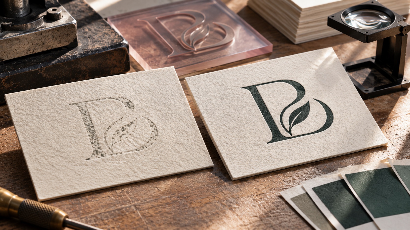
Your business cards are ready to print, or so you think. The logo is sharp in a PDF, the colors are correct on your laptop, and the paper sample looks beautiful.
Then the letterpress shop asks you to send an outlined vector file, make the fine lines thicker, and remove the gradient.
You may wonder why the same logo that works for digital printing needs changes for letterpress.
The answer is in the printing process. Letterpress uses a raised printing surface, typically a plate, that transfers ink to paper under pressure. Fine details, large solid areas, and the spaces inside small letters can behave differently than they do with digital or offset printing.
If you are ordering letterpress business cards, invitations, stationery, or branded packaging, here is how to prepare a logo that the printer can actually use.
What makes letterpress printing different?
Letterpress produces an image by pressing an inked raised surface against paper. Depending on the paper, press, and settings, the result may have a visible tactile impression.
That physical contact is part of its appeal, particularly for premium business cards and invitations.
But the press is not reproducing your screen image pixel for pixel. Your artwork must be translated into a plate or another suitable raised printing surface.
Simple, high-contrast shapes and clear typography usually translate well. Certain fine details, soft shadows, and overlapping colors can require special handling.
The printer's equipment and paper choice matter as much as the artwork.
Why letterpress printers prefer vector logo files
A vector logo is made from mathematically defined paths, not a fixed grid of pixels.
That lets the printer inspect the contours, adjust the design at its final physical size, and prepare crisp output for plate making.
Many letterpress studios request a press-ready PDF or native Illustrator artwork. Some accept EPS or packaged source files.
A JPG or PNG may be helpful as a visual reference, but not every letterpress shop accepts raster logos as production artwork.
In fact, different shops have different rules. Some will work with very high-resolution monochrome bitmap images. Others insist on vector geometry.
Check your selected printer's file requirements before paying to recreate a file unnecessarily.
A PDF can still contain a blurry image
It is possible to save a logo as PDF and still have no actual vector artwork inside it.
For example, placing a 400-pixel-wide JPG on a PDF page does not convert its edges into editable paths.
The file may open perfectly, but the underlying logo is still a flattened raster image.
A useful test is to open it in Illustrator or another capable vector editor and inspect the individual shapes.
Can the logo letters and icon be selected as meaningful vector objects, or is the entire image just one bitmap?
For a rough or flattened source, a manual redraw can produce much cleaner plate-ready geometry.
The problem with hairline strokes
Imagine a logo made from very thin serif lettering and a delicate line drawing.
On a large screen, the thin lines are attractive. On a small letterpress plate, some may be too fine to hold reliably.
One letterpress studio recommends at least 0.25-point strokes; another recommends 0.3 point or thicker. Other printers publish larger minimums for their particular jobs.
These values are supplier-specific, not a universal rule for every press or plate.
The safe approach is to review the minimum line weight at the actual finished size, using the shop's documented specifications.
If necessary, a designer can strengthen a few strokes without turning the entire logo into a different design.
Why reversed text often needs more room
Consider a white logo knocked out of a solid inked rectangle.
This is called reversed or knockout lettering. The letters are areas where ink is not printed.
In letterpress, tiny open spaces can close or lose definition because of ink spread and the mechanics of plate and paper contact.
A thin positive black line may survive where an equally thin white gap inside a dark shape does not.
That means reversed lettering often needs larger type, wider gaps, or a less delicate font.
Some letterpress suppliers explicitly set different minimum sizes for positive and reversed type.
Do not rely on a general font-size rule taken from ordinary digital printing.
Small taglines can become unreadable
A full company logo might include a main wordmark, a delicate symbol, and a long slogan underneath.
The entire arrangement can look balanced on a website. At business-card size, the slogan may turn into a dense line.
It is worth asking whether the tagline has to be letterpressed at all.
You might use:
- The main logo only on the front.
- A simplified logo without the tagline.
- A larger tagline elsewhere on the card.
- Digital printing for secondary fine text.
- A separate one-color emblem for the tactile impression.
A special print version is not necessarily a redesign. It is an approved adaptation for the production method.
Do gradients and drop shadows work in letterpress?
A conventional solid-color letterpress plate does not reproduce an unrestricted digital gradient directly.
Gradients and photographic tones may be simulated using halftone dots or other techniques, but that requires deliberate print preparation and may not be suitable for every shop.
Similarly, a soft gray drop shadow shown in your logo file does not automatically create a subtle physical shadow on paper.
If your brand mark has metallic shading or a glow, consider creating a flat-color version for the letterpress element.
You can keep the decorative version for digital media and other printing methods.
The important thing is preserving the main identity while working within the press's capabilities.
Spot colors, CMYK, and choosing the right ink
Many letterpress jobs use individually mixed spot colors rather than standard four-color CMYK printing.
Your printer may ask for a Pantone reference or another approved spot-color specification.
A screen HEX code is useful as a reference, but it does not guarantee the same appearance when ink is pressed onto uncoated, textured, or colored paper.
Request an ink and paper proof if the color match is critical.
Also confirm how many ink colors are included in the quote. Additional colors can require separate plates, setup, and registration.
This is why a two-color letterpress logo can cost more to produce than a one-color version even when the file looks equally simple.
What happens with a large solid logo?
Solid color areas are another place where expectations matter.
Letterpress may show paper texture or uneven ink coverage across large blocks, especially on thick cotton stock.
That look can be beautiful when intentional, but frustrating if you expected a completely flat digital-style fill.
Ask the shop whether your logo has a solid region too large for the preferred press and stock.
A simple outline, smaller solid area, or combination with another printing method may be more suitable.
Do not automatically redesign the logo. Review a sample from the actual printer first.
Preparing the text in Adobe Illustrator
If your logo uses live type, the printer may ask for the letters to be outlined.
This converts the type into vector shapes so the lettering does not change if the receiving computer lacks the font.
In Illustrator, the common operation is Type > Create Outlines.
Work on a duplicate production copy and retain an editable master.
After outlining, check that no important spaces inside letters are unexpectedly filled, and that the letters retain their approved proportions.
Converting fonts to outlines does not fix letters that are too small or delicate. It only preserves their current visible geometry.
How to clean up an old logo before letterpress
If you only have a screenshot, low-resolution PNG, or old auto-traced SVG, the shop may charge an artwork fee.
The problem is often not the file extension but the geometry.
A trace may contain hundreds of anchor points around what should be one smooth letter. Tiny rough shapes can become difficult to output consistently.
A cleaner logo master should have:
- Smooth deliberate curves.
- Correct lettering and spacing.
- No unnecessary hidden objects.
- Open counters inside letters.
- Approved flat colors.
- No accidental overlapping paths.
- A suitable one-color version.
If your current artwork needs reconstruction, contact VectorFixer and include the letterpress shop's requirements so the redraw matches the intended job.
How much bleed should you add?
Bleed is extra artwork outside the finished trim edge.
If the logo sits entirely inside the business card, you may not need any bleed around the logo itself.
If color extends to an edge, the printer will normally require bleed in the overall layout.
Different shops specify different amounts and may have specific requests about crop marks.
For example, one letterpress printer requests 0.125 inches of bleed where needed and also specifies text safety margins. Another uses its own workflow.
Always follow the chosen printer's template rather than assuming a common digital-printing setting is suitable.
What should you send the letterpress shop?
A useful handoff package includes:
- The approved logo in a true vector format.
- The full business card or stationery layout at finished size.
- Correct spot colors and the number of ink colors.
- Outlined type in the production copy, if required.
- The selected paper stock and color.
- Bleed and margins based on the printer's template.
- Any requested separation or plate information.
- A visual proof of the intended appearance.
- A note about which elements should be printed, embossed, or foiled.
Keep the original editable design separately.
If you are combining letterpress with digital printing or foil, confirm the shop's registration and artwork requirements before preparing the final production layers.
A practical example: a boutique business card
Imagine a jewelry studio with a thin gold script logo and the slogan "Made With Intention."
The owner wants a dark-green letterpress card with a subtle tactile logo.
A practical process might be:
- Confirm whether the logo uses dark ink on light paper or a different finish.
- Decide whether the gold effect needs metallic foil instead of a flat ink.
- Check the smallest script strokes and gaps against the printer's limits.
- Remove the slogan from the logo impression if it becomes unreadable.
- Create a simplified one-color vector version.
- Review a final-size proof and the proposed ink and stock.
The brand still feels refined, but the production artwork no longer relies on details the plate cannot reproduce reliably.
Common letterpress artwork mistakes
Sending the web PNG instead of real vector artwork
A clean-looking PNG may still be unsuitable for the printer's plate workflow.
Keeping ultra-thin strokes
Fine lines can fail during plate making or printing.
Using tiny reversed type
Small white gaps inside solid inked areas can close up.
Treating a gold gradient as metallic ink
A screen effect is not the same thing as real foil or a particular print finish.
Forgetting the final physical size
Details that look perfect at 400% zoom can become unreadable on a business card.
Assuming every printer has identical file requirements
Line widths, plate production, paper, bleed, and color workflows vary.
Frequently asked questions
Can I use a PNG logo for letterpress business cards?
Some shops accept high-resolution black-and-white artwork for particular workflows. Others require vector source files. Ask your printer before submitting a PNG.
Is a vector PDF good for letterpress?
Often, yes, provided it contains genuine vector shapes and is exported to the printer's specifications.
What is the minimum line weight for letterpress?
It varies by printer and plate. Some suppliers recommend about 0.25 to 0.3 point for certain positive lines, but reversed details can require more space.
Can a logo with gradients be letterpressed?
It may need special halftone preparation or a different process. For ordinary spot-color work, a clean flat-color version is usually easier to reproduce.
Should I outline fonts before sending the logo?
Many printers request outlined text to avoid font substitution. Save an editable copy before converting the letters.
Does letterpress always need a new logo?
No. The existing identity may only need a production-friendly variation with stronger small details or fewer effects.
Make the artwork as intentional as the finished card
Letterpress is a physical printing process. Your logo needs to work at the final size, as real paths on a plate, not just as a sharp-looking image on a screen.
Ask the printer for its exact file and plate specifications, then adapt only the details that need changing.
If your logo is a blurry JPG, flattened PDF, or messy vector file, contact VectorFixer with the artwork and printer's instructions. A clean vector redraw can give your business a reusable master for letterpress and future production work.
Need artwork converted?
VectorFixer can redraw logos, convert PNG files to SVG, and prepare clean production-ready vector files.
Contact Us